Custom CSS Bullets with ::marker
There are two established ways to create custom HTML bullets via CSS.
We’ll talk about the CSS ::marker technique, which is easy to implement, but limited in customization options. If you need more precision and control, look into the advanced method which declares list-style: none; to override the default bullet behavior.
Using ::marker to replace the HTML bullet
It’s easy to add your custom bullet, declare list-style-image: with your image and you’re 80% done. The challenge is making adjustments if your custom bullet doesn’t fit or align quite right, but before we go there, let’s demo the first steps.
First, let’s make sure you’re setup with an HTML list, with some <li> (list item) elements wrapped in an <ul> (unordered list).
<ul>
   <li>Jupiter</li>
   <li>Neptune</li>
   <li>Mars</li>
</ul>
The browser renders that unordered list like so:
- Jupiter
- Neptune
- Mars
Even if you don’t work in HTML, your WYSYWIG editor likely outputs code exactly like this. I use WordPress, where both the old TinyMCE and new Gutenberg block editor outputs this markup.
Next we need the image we want as the custom bullet. SVG icons make great bullets, so I’ll grab an SVG from our List Item collection, which has some free SVGs. I export as CSS, but if you end up with SVG code you can run it through a SVG to CSS converter to prepare for the next step.
Next we declare the image as the HTML bullet with CSS. I’m placing the rule on the li element, but if you want to apply this to a specific item or list, you can get more specific with a class or so.
li{
   list-style-image: url('data:image/svg+xml,<svg xmlns="http://www.w3.org/2000/svg" viewBox="0 0 24 24" fill="%23808"><path d="M18 4c-4-1-6 3-6 3s-2-4-6-3-4 6-2 8l8 8 8-8c2-2 2-7-2-8z"></path></svg>');
}
The code between the url( and ); is known as a Data URI, which I prefer to use because it means I don’t have to upload and link to any image files. You could use url('image-name.svg'); if you prefer to work with files. But this all that is needed to achieve the result below:
- Jupiter
- Neptune
- Mars
Sweet, we got hearts instead of the default black dots, aka disc bullets. But they’re kinda small, what if we wanted them bigger?
Sizing your custom SVG bullet with CSS
I mentioned in the beginning, with a single CSS property, we’re achieved 80% of the results were after. However, the last 20% is the much tougher to get just right. We are limited in CSS properties that can affect the size and position of these custom bullets.
This first way tool to manipulate size is by changing the font-size. We can apply one size to the list test and another size to the bullet with li::marker. If the size is bigger, you may need to also add a smaller line-height sizing to the li::marker to counter the larger vertical space added to the <li> element.
li::marker{
   font-size: 1.8em;
   line-height: 0.1;
}- Jupiter
- Neptune
- Mars
That helps us match the image size to the text, but the alignment seems off to me.
Positioning your custom SVG bullet with CSS
If we made the font-size 1.4em, I could live with the results, but this tutorial wouldn’t be as useful. With the bigger size, it’s obvious that the positioning over the <li> element is off.
Most of the usual positioning approaches fail because the ::marker only accepts a few specific properties. This means you can’t use transform: translate(X, Y), vertical-align, margin, padding, nor background-position. In fact, there doesn’t seem to be any ::marker property that shifts strictly the alignment, and any shift on the <li> element, shifts the ::marker too.
The workaround is not ideal, because it requires extra markup.
Method 1: wrap the <li> in a <span>
If we wrap a <span> around the <li>, you can apply a transform or vertical-align that will shift the content in relation to the <li> element’s position. This is the shift in alignment we want, here’s what that code might look like:
li span{
   vertical-align: 0.1em;
   transform: translate(-0.1em, 0.2em);
}
You don’t need both properties, but you certainly can use either.
If you want to avoid the extra markup, I got good news and bad news: It’s possible, but it requires manipulating the SVG.
Method 2: tweaking the SVG
If you’ve been following along, we grabbed an SVG icon that we didn’t make ourselves. I wouldn’t expect you to fire up Illustrator, make the tweaks, and re-export the SVG code — and repeat a few times to get it right.
There has to be a better way, right?!
You could tweak the viewBox, after all most icon systems are built with extra padding. Shrinking or enlarging the viewBox by 1 or 2 units often is enough to achieve the desired shift, but those unintuitive changes alter the core instructions of the SVG. Here’s what changing the viewBox would look in case it might help someone out there:
<!-- original viewBox -->
<svg viewBox="0 0 24 24"></svg>

<!-- one unit bigger above and below -->
<svg viewBox="0 -1 24 26"></svg>

<!-- two units smaller above, 1 below -->
<svg viewBox="0 2 24 21"></svg>
The most straightforward way to shift elements is a transform with a translate(X, Y). Simply wrap the inner SVG elements with a <g> group element and place a transform="" on it.
<svg xmlns="http://www.w3.org/2000/svg" viewBox="0 0 24 24">
   <g transform="translate(0, 10)">
      <path d="M18 4c-4-1-6 3-6 3s-2-4-6-3-4 6-2 8l8 8 8-8c2-2 2-7-2-8z"></path>
   </g>
</svg>
This works, but you’ll notice shifting the content too much pushes it outside the viewBox, making it clipped. With a few extra properties, we can counter this negative effect. First we’ll want to scale the SVG smaller and you can do that by adding scale(X, Y) to the transform. You’ll want a number between 0 and 1 to shrink it, where a single value will represent both the X-scale and Y-scale.
By default the SVG scales to the top left. I’m more accustomed to scaling from the center, which is why I added the transform-origin="center" to the <g>.
<svg xmlns="http://www.w3.org/2000/svg" viewBox="0 0 24 24">
   <g transform="scale(0.5) translate(0, 10)" transform-origin="center">
      <path d="M18 4c-4-1-6 3-6 3s-2-4-6-3-4 6-2 8l8 8 8-8c2-2 2-7-2-8z"></path>
   </g>
</svg>
Now that we scaled down the SVG, there is more room to shift the SVG content. But there is a new problem, it’s small. Well we already learned how to change the bullet size with font-size on the ::marker, so we can adjust that as needed to compensate.
Sizing and positioning a CSS ::marker
All those tricks together help us tweak the custom SVG bullet as desired. Here is the CSS in it’s entirety. The magic is hidden in the SVG code within the list-style-image property.
li{
   font-size: 1.2em;
   list-style-image: url('data:image/svg+xml,<svg xmlns="http://www.w3.org/2000/svg" viewBox="0 0 24 24" fill="%23808"><g transform="scale(0.5) translate(0, 15)" transform-origin="center"><path d="M18 4c-4-1-6 3-6 3s-2-4-6-3-4 6-2 8l8 8 8-8c2-2 2-7-2-8z"></path></g></svg>');
}
li::marker{
   font-size: 3.6em;
   line-height: .1;
}
Here are the results:
- Jupiter
- Neptune
- Mars
3 ways to use SVG blobs on your website (CSS)
In the last tutorial I showed you how to manually make your own blob and quickly export it. We glossed over how to integrate it onto your website.
Today let’s focus on that last part and demonstrate three ways to use blobs in your designs.
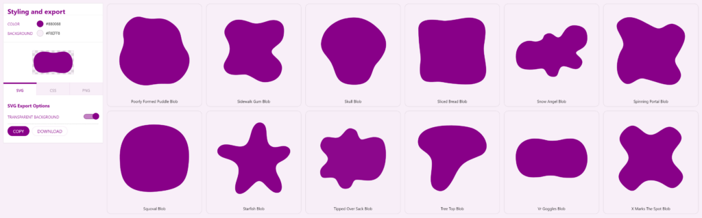
So you made a blob in Figma, Illustrator or whatnot, and if you haven’t, you can quickly grab one from the many SVG blob generators out there. I’m grabbing one from my website SVGBackgrounds.com > SVGs > Simple blobs, there’s some free ones.
We’re going to:
- Add a blob as a background
- Mask an image with a blob
- Divide two sections with a blob curve
Let’s get to it!
Adding a blob as a simple background
When you give your container a background color, it shows its rectangular boundaries which is looks boxy. Instead, if we place a blob as the background, it will look more organic and curvy.
The way to do that is with the CSS property background-image and the specify your image.svg as the value. Unfortunately with image files, you then have to upload your image to the server and type out the correct path.
Seeing as SVG is code, it’s quicker to paste a data URI as the image source instead. Link in the description for those who need to convert your inline SVG to a data URI.
/* Image file */
background-image: url(your-path/your-image.svg);

/* Data URI */
background-image: url('data:image/svg+xml,<svg xmlns="http://www.w3.org/2000/svg" viewBox="0 0 2000 1155" fill="%23808"><path d="M968.99 1033c-187.45.85-174.59 47.22-449 48-352 1-463-239-463-548 0-273.09 190-474 496-472 277.28 1.81 277.22 60.83 470 57 252-5 217.88-56.12 487-57 305-1 431 290 433 526s-117.08 502.4-432 507c-342 5-322-62-542-61Z"></path></svg>');
You’ll likely need to specify background-repeat: no-repeat because repeating the background is the default and we no longer live in the 90s.
We need a few other CSS properties to ensure the blob doesn’t get clipped. We can use background-size: contain so both the blob’s width and height are no bigger then the container. I’m also using background-position: center to center the blob.
I recommend giving the container some padding to help the content stay with in the blob.
background-image: url('data:image/svg+xml,<svg xmlns="http://www.w3.org/2000/svg" viewBox="0 0 2000 1155" fill="%23808"><path d="M968.99 1033c-187.45.85-174.59 47.22-449 48-352 1-463-239-463-548 0-273.09 190-474 496-472 277.28 1.81 277.22 60.83 470 57 252-5 217.88-56.12 487-57 305-1 431 290 433 526s-117.08 502.4-432 507c-342 5-322-62-542-61Z"></path></svg>');
background-repeat: no-repeat;
background-size: contain;
background-position: center;
padding: 30px;
Pro-tip: you can layer multiple backgrounds to make a composition with a comma separated list. The first background listed is on top. And you can manipulate all the backgrounds with a single background property (center them all) or give them all unique values—again with commas. Do not give less unique values then the number of backgrounds you’re layering.
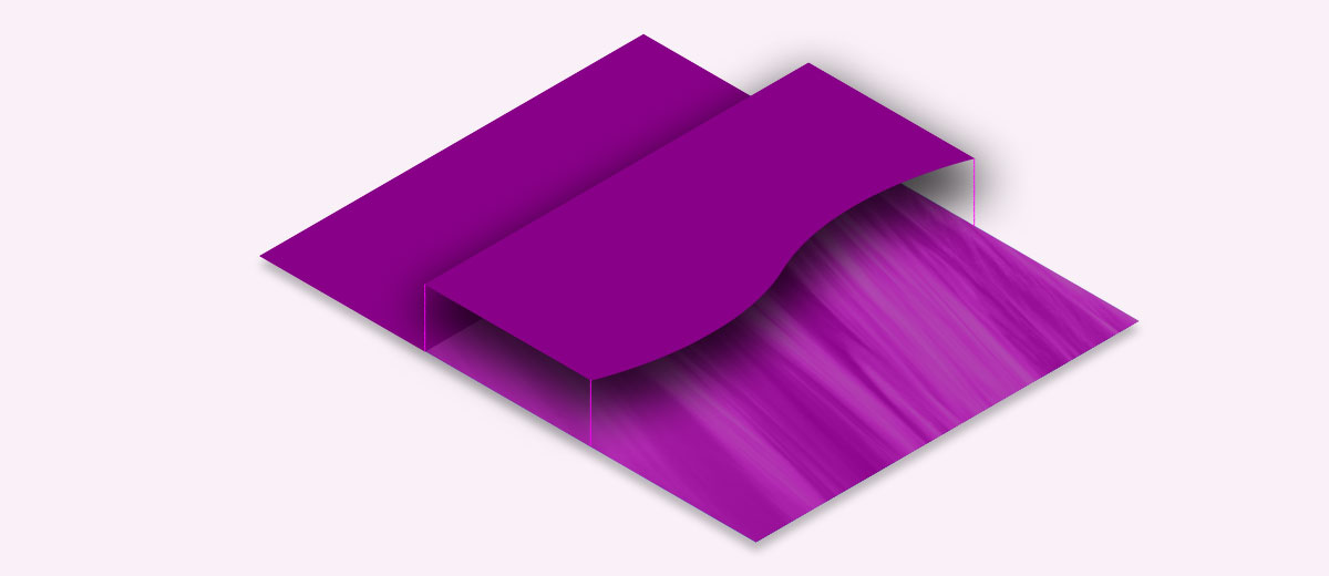
Dividing a section to avoid boxy looking design
This technique isn’t all that different from the first, however we’ll want the blob background to be clipped in a way that the the blob edge is showing on a single boundary (top, bottom, left, or right).
Since we want the blob clipped, we’re going to make the blob’s background-size bigger then 100% with the keyword cover to stretch your blob to fill the entire container or a literal value such as 150%. Then we’ll position it to a side with background-position: 50% 500px. We’ll play around with these values to work with the given blob shape.
.class{
    background-image: url('data:image/svg+xml,<svg xmlns="http://www.w3.org/2000/svg" viewBox="0 0 2000 1155" fill="%23808"><path d="M968.99 1033c-187.45.85-174.59 47.22-449 48-352 1-463-239-463-548 0-273.09 190-474 496-472 277.28 1.81 277.22 60.83 470 57 252-5 217.88-56.12 487-57 305-1 431 290 433 526s-117.08 502.4-432 507c-342 5-322-62-542-61Z"></path></svg>');
    background-repeat: no-repeat;
    background-size: 150%;
    background-position: 50% 400px;
}
TOP DIV
BOTTOM DIV
In this example, I purposefully made the bottom div the wrong color, so the technique is visible. Ideally the bottom div would match the blob color (purple in this case) to hide the container shape, making the transition seamless between the blob and neighboring container.
If we used the same blob from the first technique, we have a limited ability to position the blob. We can get it looking good, but it’s not responsive, so a change in the container size may shift the blob out of view.
To combat this, I’d prepare the SVG differently, instead positioning the blob, so it’s clipped in the SVG and position the SVG background based on the clipped side. For example, if the blob is clipped at the bottom, like in the image below, I’d bottom-align the background-image with background-position: bottom center.
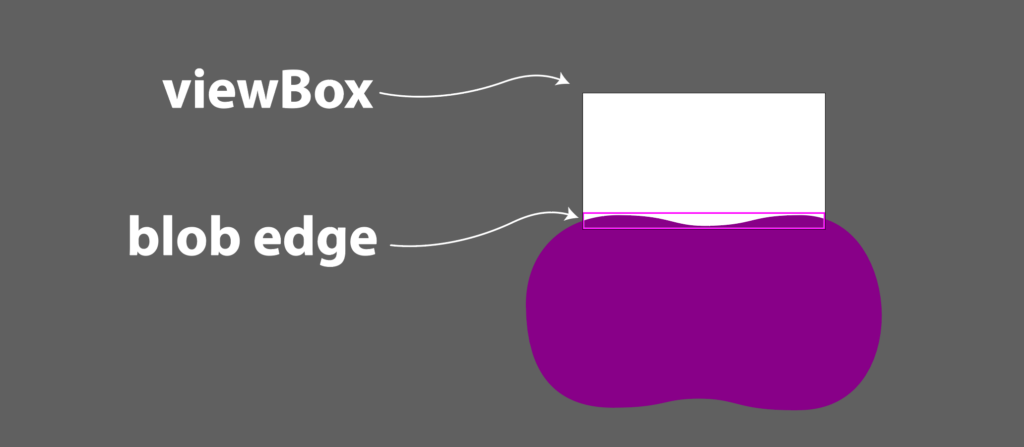
You’ll notice, most of the blob falls outside the viewBox. We are only interested in the top edge of the blob. Take notice of how I positioned the blob to fill the entire width.
Masking an image with a blob
In early web design, images were rectangles. To get rounded corners you had use your image editor, like PhotoShop, before bringing it into your web page. Now we have the lovely CSS property Border-radius to make this a cinch.
We can take this one step further and give images a more organic blob shape, using a mask.
There two ways to go about this, mask and clip-path.
I prefer using the CSS mask because it’s straightforward, as long as you’re ok with using vendor prefixes, because Chromium browsers need -webkit- preceding the mask property. But it’s well worth it because you can aslo control the size and positioning of the mask.
img.frog-mask{
  -webkit-mask: url('<dataURI>') center / contain no-repeat;
          mask: url('<dataURI>') center / contain no-repeat;
}
If I wanted to do the same thing with clip-path, I could but there’s many more steps:
- declare an inline SVG
- wrap the path in clipPath tag
- give the clipPath an ID
- give the clipPath tag an attribute of clipPathUnits=”objectBoundingBox”
- convert the path to use coordinates between 0 and 1
- reference the ID in the CSS
clip-path: url(#YOUR-ID);
Unfortunately with this method you’re out of luck if the image and SVG have different proportions, because it will stretch to fit which is often not ideal.
Using SVG blobs is CSS
We went over three practical ways to SVG blobs in your website design: as a background, shape divider, and a mask. There are probably other things you can do with blobs, but I covered the most common use cases and the CSS to apply them to your design.
Feel free to ask questions on the video version of this post (below).
If you’d like to explore and learn more about SVG and get introduced to all the crazy things you can do, make sure you visit SVGBackgrounds.com/intro — it’s both in blog and video format.
How to create SVG Blobs
You could cheat and use a SVG generator to randomly create simple blobs. However, if you want more control we’ll use a vector design program like Illustrator to manually draw the blobs.
You can use the pencil tool in a pinch, but there are two reasons I’d avoid it.
The pencil requires a steady hand and produces too many anchor points, which makes it harder to manipulate and modify the path as desired.
Instead, I recommend reaching for the Pen tool.
Create blobs with the pen tool
It can be tricky, but once you get how it works, you’ll see why I like it.
One hack is to click a bunch of points to create a shape and then round the corners using the direct selection tool to drag the live corner widgets. You can round all corners consistently or select one or more corners at a time.
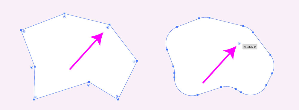
I prefer to use the anchor point tool to manually angle the curve handles. You can tweak anchors and their handles further with the direct selection tool. You can add and remove anchors points with the pen tool if you want more or less blobiness.
Exporting blobs
Once you’re ready for export, nothing is stopping you from going to FILE > SAVE AS and choosing SVG as the file type, but we can do better.
If this blob will end up on a website, you’ll likely want it as inline SVG code or as CSS.
Either way, I click and copy the blob element with CTRL + C and paste it into SVGOMG optimizer with CTRL + V. This web tool strips out some bloated and unnecessary markup Illustrator produces. Click the copy icon and the optimized code is in your clipboard.
An optional step, if you want to have the blob as a CSS background-image, we’ll use the SVG to CSS convertor to spit out a class. Again all done with copy and paste.
Lastly, you’re ready to paste the code into your code editor.
CSS can’t animate gradients, but SVG can
Want to animate gradients for your website, but sad that CSS can’t help? Well it’s time to learn about SVG gradients and how to animate them. Animation preview, code, and video below.
Here’s a live preview of the Animated SVG:
<svg xmlns="http://www.w3.org/2000/svg" viewBox="0 0 1920 1080">
   <defs>
      <linearGradient id='a' gradientUnits='objectBoundingBox' x1='0' y1='0' x2='1' y2='1'>
         <stop offset='0' stop-color='red'>
            <animate attributeName="stop-color"
               values="red;purple;blue;green;yellow;orange;red;" dur="20s" repeatCount="indefinite">
            </animate>
         </stop>
         <stop offset='.5' stop-color='purple'>
            <animate attributeName="stop-color"
               values="purple;blue;green;yellow;orange;red;purple;" dur="20s" repeatCount="indefinite">
            </animate>
         </stop>
         <stop offset='1' stop-color='blue'>
            <animate attributeName="stop-color"
               values="blue;green;yellow;orange;red;purple;blue;" dur="20s" repeatCount="indefinite">
            </animate>
         </stop>
         <animateTransform attributeName="gradientTransform" type="rotate" from="0 .5 .5" to="360 .5 .5"
            dur="20s" repeatCount="indefinite" />
      </linearGradient>
      <linearGradient id='b' gradientUnits='objectBoundingBox' x1='0' y1='1' x2='1' y2='1'>
         <stop offset='0' stop-color='red'>
            <animate attributeName="stop-color"
               values="red;purple;blue;green;yellow;orange;red;" dur="20s" repeatCount="indefinite">
            </animate>
         </stop>
         <stop offset='1' stop-color='purple' stop-opacity="0">
            <animate attributeName="stop-color"
               values="purple;blue;green;yellow;orange;red;purple;" dur="20s" repeatCount="indefinite">
            </animate>
         </stop>
         <animateTransform attributeName="gradientTransform" type="rotate" values="360 .5 .5;0 .5 .5" class="ignore"
            dur="10s" repeatCount="indefinite" />
      </linearGradient>
   </defs>
   <rect fill='url(#a)' width='100%' height='100%' />
   <rect fill='url(#b)' width='100%' height='100%' />
</svg>
Free SVG Generators
This article covers where you can find some of the best free SVG generators on the web.
What is an SVG generator?
An SVG generator is software that creates graphics to be output in the SVG image format. Creating graphics by hand can take hours, so the clear benefit is that SVG generators can do the same work in milliseconds.
These generators come with a simple user interface (UI), enabling you to iterate and make unique designs with the click of a button. For instance, changing the color of graphics by hand is relatively easy, but it can quickly get redundant when 20+ elements are involved. The challenge increases when you want to randomize colors or transition from one color to another in multiple steps. This logic is trivial to computers, which shred these tasks in the literal blink of an eye.
There is a wide variety of SVG generators that can create patterns, textures, shapes, and more. Some handle a specific task like creating blobs, while other generators manipulate a huge library of graphics.
Let’s review some of our favorite free SVG generators on the web, in each category.
SVG texture generator
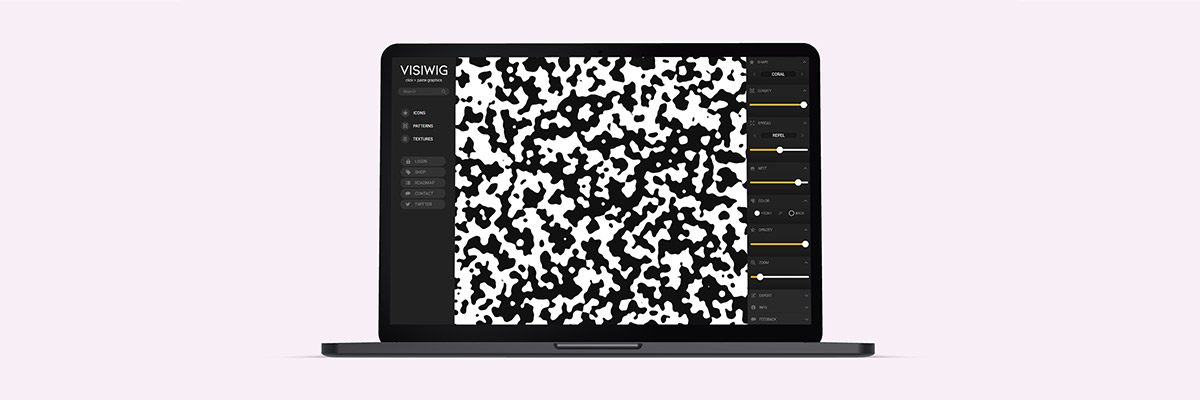
Creating vector texture by hand is impossibly slow. This tool demonstrates just how powerful and useful SVG generators are. The SVG Textures tool creates randomized shapes and distributes hundreds of those shapes all over the page. You can control the shape, how many shapes, and how they spread. There is also a cool option to melt the neighboring blobs together. There are some more common controls to change colors, opacity, and zoom. Lastly you can export the results as a PNG or SVG.
- SVG Textures (free)
SVG background generator
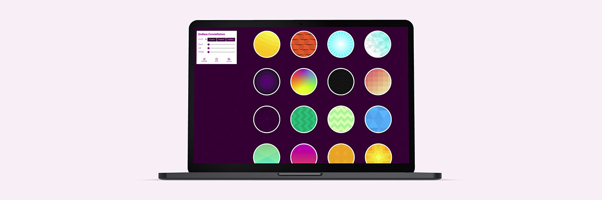
Creating interesting backgrounds for websites is no easy task. SVGBackgrounds.com has a collection of over 200 backgrounds (48 free) that you can customize to fit your style, including abstract designs, complex gradients, and geometric patterns. One of the powerful features is the ability to input a few colors, and the generator calculates the spectrum of the colors between, creating dazzling color blends.
- SVG Backgrounds (free and paid)
SVG pattern generator
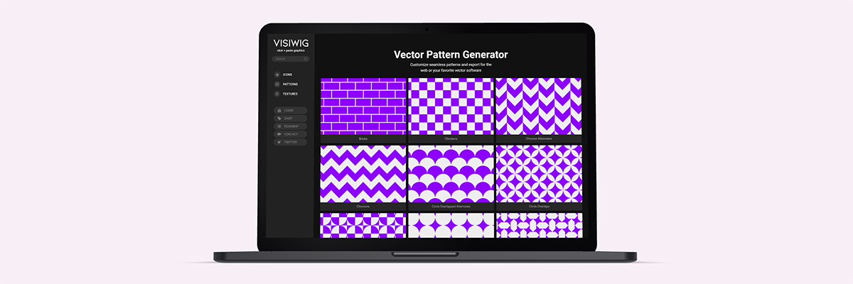
SVGs make patterns on websites mesmerizing, as they add two distinct capabilities that regular pixel patterns can’t achieve without bloating file size: large patterns and off-center patterns. With an SVG pattern generator, you can quickly scale, rotate, colorize, and output the pattern to a website or software. The Vector Pattern Generator, linked below, has a feature to display some patterns as a fill or outline. In each case you can change the stroke-width to create unique patterns. SVG Backgrounds has many styles across 100+ patterns, including seamless 3d patterns, organic textures, and colorful repeating patterns.
- Vector Pattern Generator (free and paid)
- SVG Pattern Backgrounds (free and paid)
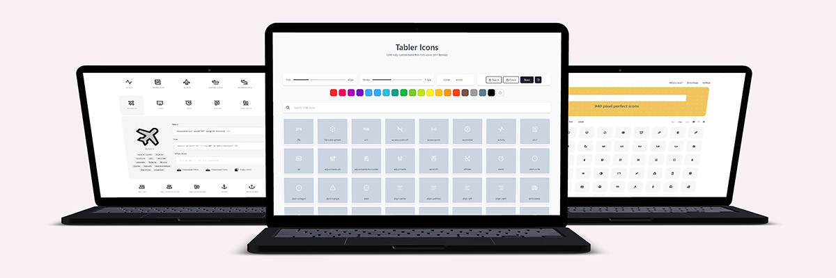
SVG icon generators
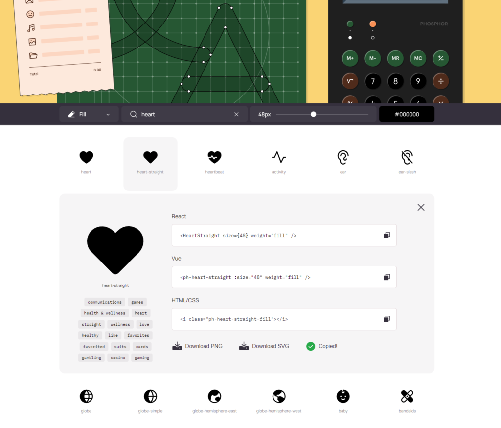
Icons are small graphics that pack a powerful punch on websites. Traditionally, icons are distributed in packs (or files) where you manage hundreds, if not thousands, of icons. Packs make finding the right icon a difficult task, where prepping the file for your website can be a hassle. SVG generators on the other hand make searching and prepping your desired icons easy. The generator UI can help you change the color, stroke width, icon size, filter the search results, and finally copy and paste the icon right into your website or software.
- Tabler Icons (free)
- Phosphor Icons (free)
- Jam Icons (free)
- Indie Icons (free)
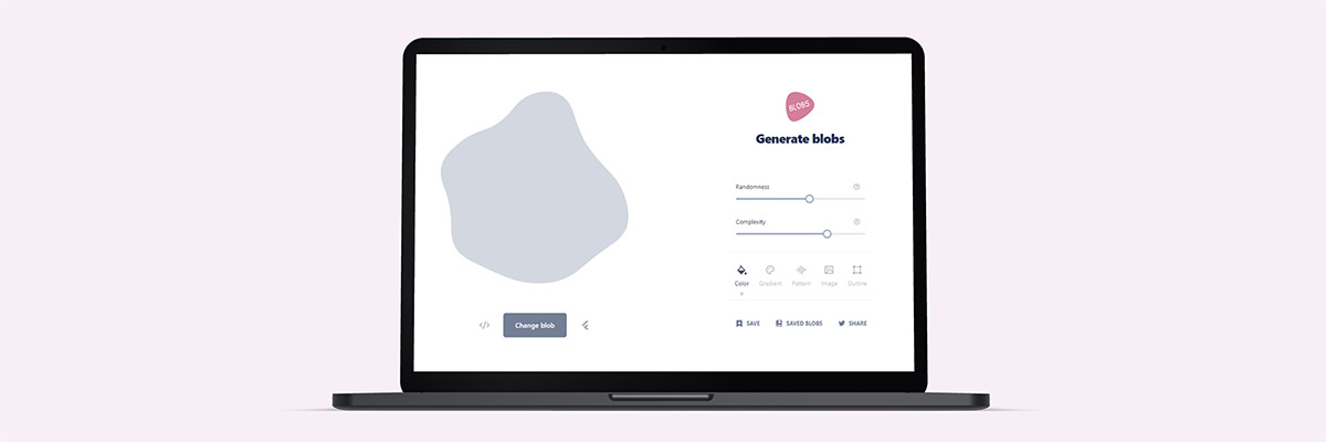
SVG blob generator
Computers are great at creating randomness and generating randomized blob shapes is no exception. The blob maker app will help you create simple or complex blobs. You pick how rigid or bloated the blob is and how many points make up the blob (a number between 3-20). The SVG generator will connect and draw those points in a smooth fashion. Runner up, we SVG Backgrounds has a collection of pre-made blob shapes.
- Blobs.app (free)
- Simple SVG Blobs (free and paid)
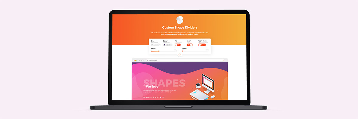
SVG divider generator
Websites can look blocky, especially when you alternate sections with solid colors. One clever fix is to divide these sections with wavy and curly lines. Custom Shape Divider generates these interesting shapes quickly to help websites avoid the default rectangular look.
- SVG Shape Divider Generator (free)
- Custom Shape Divider (free)
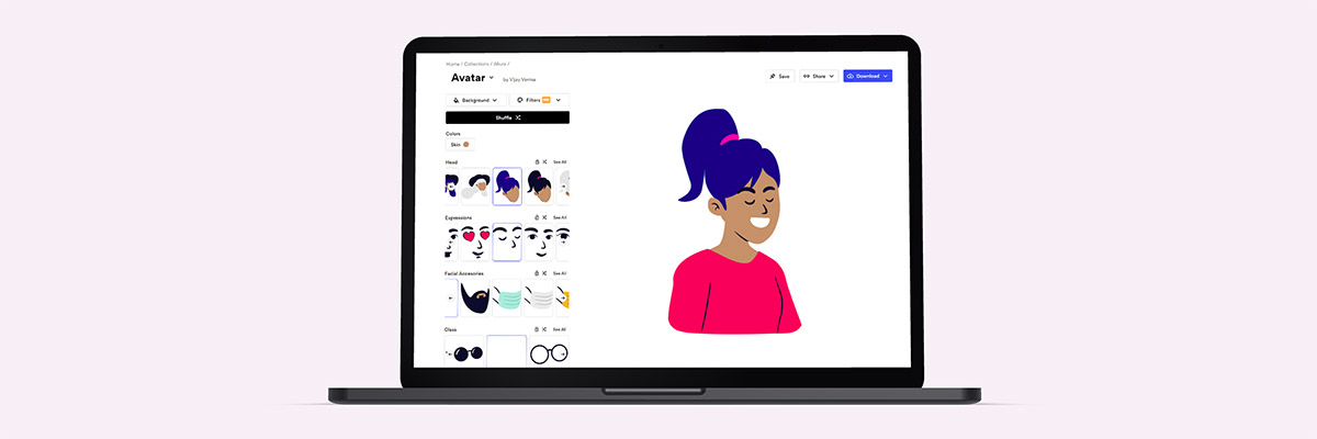
SVG illustration generator
Customizing illustrations is tricky, and generally requires professional design software and training to do more than change colors. That’s why Blush’s SVG generator is empowering to your average designer. It intuitively allows you to quickly mix and match illustration elements to create unique characters and scenes. While Blush has a giant collection of illustration scenes and styles, the free version limits the editing and output capabilities.
- Blush (free and paid)
SVG generators are here to stay
There are all sorts of SVG generators, and they certainly make our design tasks faster and our lives easier. SVG generators save us time by handling the redundant visual tasks that a computer can complete in under a second. In many cases, we conveniently don’t even need to fire up professional software to customize professional graphics.
We hope you discovered some new SVG generators and bookmarked them!
3 ways SVG can help websites look less blocky
The initial state of HTML elements are rectangles. While you can give HTML containers rounded corners to break up the square design, this only helps minimally. SVGs can drastically transform blocky webpages, hiding the fact that all the building blocks are four-sided.
Here are the 3 ways SVGs can help web pages look organic
1) SVG Section dividers
When you give website sections a background color, by default the two neighboring sections are separated by a straight line. It doesn’t get much more boxy than that, unless we’re talking about a grid of evenly distributed boxes.
How to make section transitions less square:
Create a full-screen shape that will stretch from the left side of the screen all the way to the right. The shape and it’s background need to match the neighboring colors. This could be simple as matching the color of each section, but can work with a solid color over a photograph.

How to implement an SVG divider
To achieve this effect with CSS, we can give two images to a single background-image property. The first will be the SVG positioned to the top with a 100% width. The second with be the photo with a background-size: cover to fill the entire section.
.section-divider{
   background-image: url(<svg code>), url(/img.jpg);
   background-position: top center, 50%;
   background-size: 100%, cover;
   background-repeat: no-repeat;
}
Notice when two arguments are used for the background-image, you can give other background-image properties one value to affect both images or give two values to affect both in different ways.
2) SVG backgrounds with angles or curves
Solid color backgrounds or repeating geometric patterns can emphasize how a web page is rectangular. Therefore, if we reach for designs that don’t line up with the screen, the boxy design isn’t as apparent. Curves work hardest to pull your eyes away from the square nature of the screen.
How to make backgrounds less square:
Choose backgrounds with curves or angles that contrast from the straight lines of the content, screen, or containers. Here are a few quick example backgrounds I pulled from SVGBackgrounds.com:
You can also use radial gradients or angled linear gradients to bring attention to various parts of the screen. If you overlap multiple gradients, you can mimic mesh gradients, which are not currently compatible with SVG at this time.
Lastly, if you select a repeating pattern, you can rotate them slightly, so everything doesn’t line up with the screen perfectly. You can additionally scale the SVG pattern large to deemphasize the symmetrical nature of patterns. You can get free SVG patterns with this Vector Pattern Generator.
3) SVG blobs, illustrations, and other shapes
Web design is built on the CSS box model, which naturally causes default content to be constrained by rectangular design. There is no need to escape the containers to achieve a less-blocky design. The trick is to keep the container’s background transparent, bringing the focus to the content’s irregular, curvy shapes.
How to make page elements less square:
Shapes and blobs can help de-emphasis the container, especially when the background image is transparent. There are three obvious elements that can pull off this tactic.
SVG blobs
Using blobs in one way or another has become a popular trend in web design. One way to use blobs is to place content right over it, making the blob like an organic container. Another way is placing blobs of various sizes in the background, which tends to hide straight lines and boxy containers.
SVG illustrations
Illustrations are naturally full of organic edges and shapes that break the rectangular mold. Images of illustrations are generally contained within a rectangular canvas, so you must ensure there is no background color to avoid the canvas from being noticeable. A great resource to find SVG illustrations is unDraw.
SVG shapes and icons
Using icons or shapes on your web pages can grab the users’ eyes, placing emphasis on elements that don’t use boxy design. I already wrote an entire article on where to get great SVG icons (and shapes). SVG icons and shapes are often aligned to content, but I’ve also seen them used as background elements, to lessen the uniformity that results from four-sided design.
Thinking outside the blocks
While everything you design for webpages starts with rectangular containers, you don’t need to settle with blocky design. Instead reach for SVGs to think outside of the box. You can always rely on section dividers, backgrounds, or shapes. Don’t be square!
The fastest icons in the Wild Wild Web
In this article, I’m going to show you the fastest way to integrate icons into your web projects. Hint, it’s literally click and paste.
But let me disappoint you first. You’re not going to find the fastest resources with a quick google search. In fact, when you look for icons to use on your website, a search will bring you to some well known sites and icon sets:
- The Noun Project
- FlatIcon
- Icons8
- Icon Finder
- Freepik
- FontAwesome
BUT, they come with barriers that we intend to avoid.
What do we want?
The SVG code!
When do we want it?
Instantly!
6 rules for faster icons
Not all icon collections are built the same. Some icon collections are large and some are small. Some are built as PNGs, SVGs, icon fonts, icon sprites, or left in a design file like Adobe Illustrator. But for your icons to travel at the speed of light, they have to adhere to a few rules. 6 very specific rules.
Let me spell out what we are looking for:
- SVG icons and not JPG/PNG, ZIPs, Fonts, or design files
- No software required to customize SVG (color with CSS)
- Files create extra steps
- No arbitrary barriers, like registration
- Barriers slow you down, but we have a need for speed
- Barriers slow you down, but we have a need for speed
- No cost or attribution required
- Paywalls are a barrier, attribution adds another step
- Paywalls are a barrier, attribution adds another step
- A search mechanism to quickly find relevant icons
- Looking at a grid of a thousand icons is slow
- Looking at a grid of a thousand icons is slow
- A sizeable icon set with consistent design
- If the icons don’t match in style, they’ll look bad together
- If the icons don’t match in style, they’ll look bad together
- A way to click and paste code
- Pasting code into HTML is fast and easy
Before I get to the list of good sites, I must stress I’m going to be strict. If you fail to meet one of those bullet points, you’re off the list.
For instance, Google Fonts has an impressive free icon tool. There is a huge collection of searchable SVG icons, no registration required, but it fails. It fails because there is no simple way to copy-and-paste the SVG code. You can download the icon as an SVG or add the icons as a font, but neither of these methods meet the criteria for being lightning quick.
I researched far and wide to curate this list of qualifying icon websites. I had to visit hundreds of websites, click around, test icons, read licenses, type in searches, and test the output. When you click a button: some sites copy the code, some open a modal, and some proceed to download a file. I unwittingly downloaded hundreds of icon files testing out websites to see what method they used by default. But I did this all for you.
Let’s get right to the list, then I’ll break down the steps to add an icon to your next project.
18 lightning fast SVG icon sites:
- Boxicons (1525)
- Tabler Icons (1298)
Top Pick - Remix Icon (1135×2)
- Jam Icons (940)
Top Pick - Phosphor Icons (894×3)
Top Pick - Glyphs (860+)
- Teeny Icons (720+)
- System UIcons (420)
- Pixel Art Icons (350+)
- Radix Icons (400)
- Akar Icons (350)
- Material Line Icons (250)
- Hero Icons (230×2)
- Indie Icons (200+)
I made this - Mono Icons (177)
- IconPark (2400×4)
- Bootstrap Icons (1370)
- Iconmonstrr (4260+)
How to place your icons into your web project quickly
Now that you know WHERE to find good icons for your website or web-based app, it’s time to delve into the secret world of icon placement. The process is as easy as 1-2-3.
- Pick your icon
- Paste your icon
- Style your icon
Let’s look at each step.
Step 1: Pick and copy your icon
Up to this point, you have been preparing for this very moment. After visiting an icon site from the list above, you can search for the icon you need. In my case, I searched for a “crown” icon.
Then click to copy the icon SVG code.
The sites I provided are generally intuitive, but it may take a few seconds to locate the correct copy button on your first visit. Most sites have a copy mechanism that uses some variation of a “Copy SVG code” button, or clicking the icon directly, or even clicking a blob of SVG code.
Now that you have the SVG code in your clipboard, you’re ready to proceed.
Step 2: Paste your icon
This SVG code you are about to paste is powerful. Do you think I’m being silly or exaggerating? No, I’m serious. To the untrained eye, it looks like a blob of code. But you can paste this directly into software like Illustrator or Figma. That’s powerful, but for today you’re right: it’s just a blob of code.
Where to paste: We need to paste this into HTML. The great thing is that any tool you use to build your website likely outputs everything to HTML. Writing in PHP or JS? You’ll output to HTML. Are you using a page builder like Webflow or Elementor? You’ll output to HTML. Writing a blog post on WordPress, use an HTML element to—you guessed it—output to HTML!
Type CTRL+V or Command+V to paste the code in the desired place.
Bonus: to optimize the SVG code blob before you paste, I often use SVG OMG. It can shed 10-30% of the unnecessary code. You can also use it to inline the styles or deal with whitespace. We’ll talk about SVG optimization further another day.
Step 3: Style your icon
The code blob is SVG code. And if you stare at it long enough, it’s almost readable.

When you know what attributes you are looking for, it makes it easy to edit. Let’s spell out the two most important ones: color and size. Some of the icon sites have a color/size editor like Tabler Icons, Phosphor Icons, and the one I made (Visiwig.com) if you would rather not mess with the code.
Changing the color:
The two attributes that affect the icon color are fill and stroke. Generally speaking, if the icons are solid, you’ll want to change the fill color. If the icon is outlined, you’ll want to change the stroke color and set the fill to none (fill=”none”). You can use color names like “red” or input hex codes like #F00.
<!-- Red fill (fill="#F00") -->
<svg xmlns="http://www.w3.org/2000/svg" viewBox="-2 -4 24 24" width="40" height="40">
  <path fill="#F00" d="M9.293 1.55l.707.708.707-.707a5 5 0 117.071 7.071l-7.07 7.071a1 1 0 01-1.415 0L2.222 8.622a5 5 0 117.07-7.071z"/>
</svg>

<!-- Purple outline (stroke="#808" fill="none") -->
<svg xmlns="http://www.w3.org/2000/svg" viewBox="-2 -4 24 24" width="40" height="40">
  <path stroke="#808" fill="none" d="M9.293 1.55l.707.708.707-.707a5 5 0 117.071 7.071l-7.07 7.071a1 1 0 01-1.415 0L2.222 8.622a5 5 0 117.07-7.071z"/>
</svg>You could also control the color via CSS if you prefer, like so:
<!-- Change via CSS (class="icon") -->
<svg class="icon" xmlns="http://www.w3.org/2000/svg" viewBox="-2 -4 24 24" width="40" height="40">
  <path d="M9.293 1.55l.707.708.707-.707a5 5 0 117.071 7.071l-7.07 7.071a1 1 0 01-1.415 0L2.222 8.622a5 5 0 117.07-7.071z"/>
</svg>

<style>
   .icon{
      fill: blue;
      stroke: black;
   }
</style>If you desire to change the background color, you’ll want target the SVG or icon container with a background color:
<!-- Change the background color inline -->
<svg class="icon" xmlns="http://www.w3.org/2000/svg" viewBox="-2 -4 24 24" width="40" height="40" style="background-color:yellow;">
  <path d="M9.293 1.55l.707.708.707-.707a5 5 0 117.071 7.071l-7.07 7.071a1 1 0 01-1.415 0L2.222 8.622a5 5 0 117.07-7.071z"/>
</svg>

<!-- Change background color with CSS -->
<style>
   .icon{
      background-color: yellow;
   }
</style>Editing the size:
There are a few factors that affect the icon size: width and height of the SVG or container, as well as the stroke-width for outlined icons.
On the above color demo’s the size was always 40px (the unit is implied). Let’s change that with both the inline method and via CSS and see what we get:
<!-- Change the background color inline -->
<svg xmlns="http://www.w3.org/2000/svg" viewBox="-2 -4 24 24" width="60" height="60">
  <path d="M9.293 1.55l.707.708.707-.707a5 5 0 117.071 7.071l-7.07 7.071a1 1 0 01-1.415 0L2.222 8.622a5 5 0 117.07-7.071z"/>
</svg>

<!-- Change background color with CSS -->
<svg class="icon" xmlns="http://www.w3.org/2000/svg" viewBox="-2 -4 24 24" >
  <path d="M9.293 1.55l.707.708.707-.707a5 5 0 117.071 7.071l-7.07 7.071a1 1 0 01-1.415 0L2.222 8.622a5 5 0 117.07-7.071z"/>
</svg>

<style>
   .icon{
      width: 100px;
      height: 100px;
      fill: red;
   }
</style>Wrapping up the project
We went over the basics to quickly find a suitable icon and get it into our web project in a flash. After you go through the process a few times, you’ll discover how truly fast you can add a nice touch to your design. All it takes is a quick search, a click and paste, and a little customization to get it just right.
Lastly, while no attribution is required, it doesn’t hurt to show your love and support by sharing them on social media or crediting the authors somewhere.

Hey, I'm Matt , the creator behind SVG Backgrounds. I produce free and paid resources every month, sign up for alerts.