SVG basics: Styling shape elements
There are a few foundational attributes you can use to change the appearance of SVG shape elements: fill, stroke, and opacity.
We will breakdown these style attributes that you can manipulate to affect SVG element styles.
Styling SVG fill
Fills can be solid colors, gradients, or patterns and it behaves similar to the background property in CSS.
When you don’t specify a fill on a shape element, the fill will default to black (fill="black"). To override this behavior, you need to specify the fill or give it a fill of NONE like so: fill="none".
If you define a <linearGradient>, <radialGradient>, or a <pattern>, you can reference the element’s ID in your fill attribute as demonstrated below:
<defs>
   <pattern id="My_Pattern" ...>
</defs>
<path fill="url(#My_Pattern)" ...>
You can manipulate the fill in CSS, for example:
.my-class{
   fill: purple;
}
Styling SVG strokes
Strokes are the outlines along a shape’s path and unlike the single attribute dedicated to the fill, there are nearly 10 attributes that style the stroke’s appearance.
The main attribute is stroke and the default value is stroke="none" so you’ll never see a stroke unless you specify one. This attribute determines the coloring of the stroke. The stroke can be a color, gradient, or pattern, exactly like the fill.
The thickness of the stroke is controlled by the stroke-width attribute, which has a default value of 1 (stroke-width="1").
Vector graphic software, such as Adobe Illustrator, allows you to position the stroke inside, outside, or centered between in-and-out-side. Unfortunately, there is no attribute to achieve this positioning with SVG, The stroke is always positioned half inside and half outside.
Let me illustrate what that means below.
Above: You’re looking at three circles of the same size, only the stroke position is different. The inside stroke is applied to the left circle and the outside stroke is applied to the right circle. SVG can only achieve strokes positioned like the middle circle, where you see the stroke half inside and half outside.
Since we are only covering the basics of styling SVG elements, we’ll take a deeper dive on stroke attributes another time, but let’s mention the remaining attributes.
You’ve got stroke-linejoin, stroke-linecap, and stroke-miterlimit to determine how the stroke appears at corners and ends. This is how you can achieve rounded strokes and bevels.
The attributes stroke-dasharray and stroke-dashoffset allow you to achieve gaps in where the stroke appears along a given path. The combo of the two attributes is often used in animations where a line is drawn right before you’re eyes.
You can manipulate the stroke in CSS, for example:
.my-class{
   stroke: purple;
   stroke-width: 5;
   stroke-linejoin: round;
   stroke-linecap: round:
   stroke-miterlimit: 10;
   stroke-dasharray: 4 4 16 16;
   stroke-dashoffset: -3;
}
Styling SVG opacity
Opacity is a numeric value that determines how visible or transparent an element appears. The value can be a number from 0 to 1, where the lower the number, the more see-through the given element appears. A value of 0 makes the shape completely invisible and 1 makes the shape is completely visible.
There are three relevant opacity attributes:
- Opacity
- Fill-opacity
- Stroke-opacity
The opacity attribute affects both the fill and stroke of the associated elements, while you can also target strictly the fill or stroke opacity respectively with the fill-opacity and stroke-opacity attributes.
You can also place opacity attributes on the <g> (group) element to affect grouped elements together, as though they were one graphic. For instance, if you have two overlapping red circles and you applied an 0.5 opacity to each individually, they’d look like a Venn diagram where the intersecting part is less opaque. However, if those circles where a group with the very same opacity instead, they would appear to be a single partially visible shape.
What we learned about SVG style attributes
In the world of SVG, you can do a lot visually with the simple attributes we learned about today: fill, stroke, stroke-width, and opacity. These attributes are commonly found in SVGs and once you get a hang of the basics, you can achieve a wide range of designs and effects with SVG.
If you’d like to explore and learn more about SVG and get introduced to all the crazy things you can do, make sure you visit SVGBackgrounds.com/intro — it’s both in blog and video format.
SVG basics: drawing circles and ovals
There are three ways to draw circles in SVG:
- The SVG
<circle>element - The SVG
<ellipse>element - The SVG
<path>element
Below is the code for drawing the same exact circle, using each method.
<svg viewBox="0 0 500 250">
   <circle cx="250" cy="125" r="120"/>
   <ellipse cx="250" cy="125" rx="120" ry="120"/>
   <path d="M370 125c0 66.3-53.7 120-120 120s-120-53.7-120-120S183.7 5 250 5s120 53.7 120 120Z"/>
</svg>
The SVG <path> element handles complex shapes, but is hard for humans to read and write. Especially when curves are involved as demonstrated by the code above. Therefore, we will concentrate on the first two methods of creating circles: <circle> and <ellipse>.
Circle and ellipse coordinates
Most SVG shape elements like <rect> have X and Y attributes to plot the top-left point of the shapes along the viewBox coordinate system. Uniquely, both the <circle> and <ellipse> elements use CX and CY attributes to plot the middle of the circular shape along the viewBox coordinate system.
Styling circle and ellipse elements
Both the <circle> and <ellipse> elements can be styled using the typical style attributes: fill, stroke, and opacity.
<svg viewBox="0 0 500 250">
   <circle
      fill="purple"
      stroke="blue"
      stroke-width="15"
      fill-opacity=".5"
      cx="250"
      cy="125"
      r="120"
   />
</svg>
Let’s talk about how these two elements differ.
The width and height of circular SVG elements
So far, we addressed how the circle and ellipse elements are similar. And the two elements are nearly identical. Outside of their element keyword, the difference is how they handle size.
(left) Circle’s are shapes with edges that are equidistant from it’s center point. Therefore the width and height are always the same and you can set that value through a single R (radius) attribute.
(right) Ellipses on the other hand can have variation in the width and height, therefore they have a vertical and horizonal radius with the RX and RY attributes.
What we learned about SVG circles and ellipses
While there are three ways to draw circles in SVG, we showed the two common ways to hand code circles in SVG: <circle> and <ellipse>. Both elements are unique in that they have CX and CY attributes for specifying their coordinates based on the center point of the shape. But they also differ in how they handle size based on their single or dual radius.
CSS can’t animate gradients, but SVG can
Want to animate gradients for your website, but sad that CSS can’t help? Well it’s time to learn about SVG gradients and how to animate them. Animation preview, code, and video below.
Here’s a live preview of the Animated SVG:
<svg xmlns="http://www.w3.org/2000/svg" viewBox="0 0 1920 1080">
   <defs>
      <linearGradient id='a' gradientUnits='objectBoundingBox' x1='0' y1='0' x2='1' y2='1'>
         <stop offset='0' stop-color='red'>
            <animate attributeName="stop-color"
               values="red;purple;blue;green;yellow;orange;red;" dur="20s" repeatCount="indefinite">
            </animate>
         </stop>
         <stop offset='.5' stop-color='purple'>
            <animate attributeName="stop-color"
               values="purple;blue;green;yellow;orange;red;purple;" dur="20s" repeatCount="indefinite">
            </animate>
         </stop>
         <stop offset='1' stop-color='blue'>
            <animate attributeName="stop-color"
               values="blue;green;yellow;orange;red;purple;blue;" dur="20s" repeatCount="indefinite">
            </animate>
         </stop>
         <animateTransform attributeName="gradientTransform" type="rotate" from="0 .5 .5" to="360 .5 .5"
            dur="20s" repeatCount="indefinite" />
      </linearGradient>
      <linearGradient id='b' gradientUnits='objectBoundingBox' x1='0' y1='1' x2='1' y2='1'>
         <stop offset='0' stop-color='red'>
            <animate attributeName="stop-color"
               values="red;purple;blue;green;yellow;orange;red;" dur="20s" repeatCount="indefinite">
            </animate>
         </stop>
         <stop offset='1' stop-color='purple' stop-opacity="0">
            <animate attributeName="stop-color"
               values="purple;blue;green;yellow;orange;red;purple;" dur="20s" repeatCount="indefinite">
            </animate>
         </stop>
         <animateTransform attributeName="gradientTransform" type="rotate" values="360 .5 .5;0 .5 .5" class="ignore"
            dur="10s" repeatCount="indefinite" />
      </linearGradient>
   </defs>
   <rect fill='url(#a)' width='100%' height='100%' />
   <rect fill='url(#b)' width='100%' height='100%' />
</svg>
The ultimate guide to creating SVG patterns for websites
We’re gonna take an indepth look at how to create patterns, so you know how to approach designing patterns with SVG.
The four pattern-making skills you are going to learn are:
- How to identify patterns
- How to position elements within tiles
- How to design and code SVG Patterns (3 different styles)
- How to apply SVG patterns to a webpage
How identify pattern tiles
When you can look at a repeating pattern and see the tile, you’ll quickly understand how it was built. More importantly, when something goes wrong while building your own patterns, the ability to identify tiles translates to the ability to identify why a pattern doesn’t look right.
Understanding the pattern tile
The tile is the smallest unit of a pattern. A pattern is formed when the pattern tile is cloned into a grid, where all columns and rows share the width and height of the tile respectively. Most pattern tiles are rectangular, but patterns can be made from other repeating shapes, such as hexagons.
In SVG, the tile must be rectangular. Even patterns that were originally made from hexagonal tiles, can be recreated as in rectangular form.
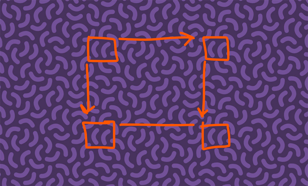
Finding a tile in a seamless pattern
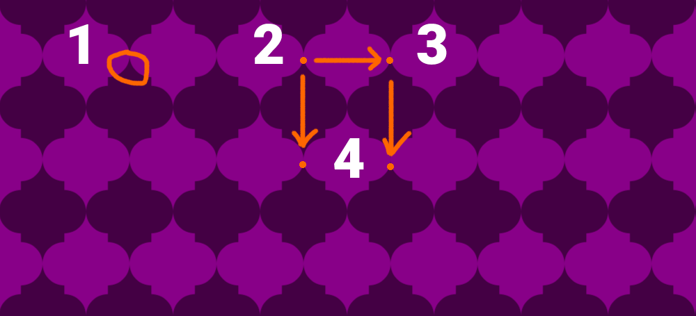
When determining the tile of a seamless pattern, we want to systematically locate repeating features in the pattern.
The steps to identify the pattern tile:
- Identify a repeating feature in the design
- Mark a unique point on that feature
- Move horizontally to find and mark the next instance at the same point
- Move vertically from both marks to find that same instance, mark those points
In this quatrefoil pattern, first I’d note there are many dark and light purple shapes and mark the tip a dark point. Then moving to the right, find the same point on the next dark shape. And do the same for the spots under those two points.
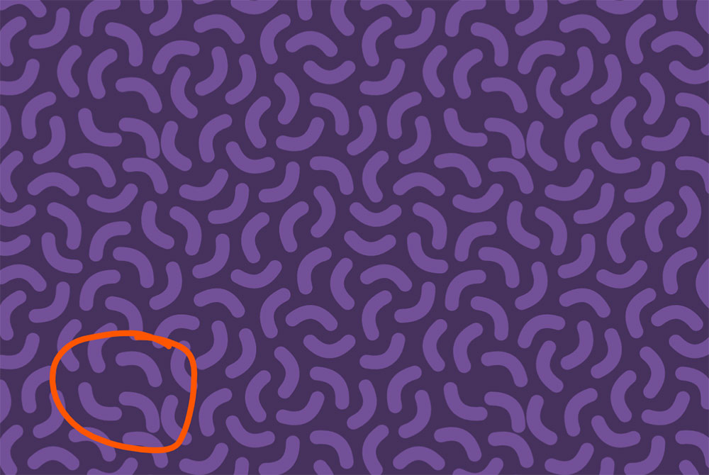
Finding tiles in complex patterns
In most cases, you will mark four points that form a rectangle on the first try, and locate the tile.
However, complex patterns with large tiles can have repeating elements within the tile, making this exercise more challenging. In that case you may need to expand the boundaries of your points or pick different features and try again.
Worse, the tiles could be rotated, so instead of moving horizontally, and vertically, you may have to adjust accordingly and move at an angle.
How to position elements within tiles
Now that you can identify rectangular tiles in patterns, you’re ready to learn how to create your own tiles.
When you place any shape within the boundaries of a tile, it will nicely repeat as a pattern.
That changes when you place that same element where it crosses a boundary (AKA edge) of the tile. In this situation, the element will appear clipped in the pattern.
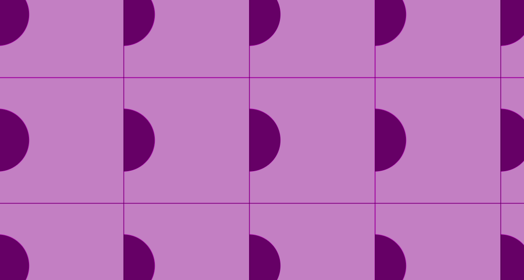
The way to prevent this clipping is to clone the same element on the opposite boundary. If the boundary falls on a corner, clone the element on all the other tile corners.
How do we make sure the clones align perfectly? It’s simple math. When we’re dealing with the left and right boundaries, you’ll add or subtract the tile’s width to the X coordinate and keep identical Y coordinates. Use the height for top and bottom calculations. Use a combo of the width and height for the corner boundaries.
How to design and code SVG Patterns (3 different styles)
We’re going to demonstrate how to design and code three patterns, all with a different technique.
Designing an alternating pattern
Alternating patterns are relatively simple, making it perfect for an introduction to the pattern element.
First we’re going to declare an empty 100×100 pattern.
<pattern width="100" height="100">

</pattern>
By default the pattern’s coordinate system (patternUnits='objectBoundingBox') is percentage-based which is awkward because patterns distort to fit the container. Instead, I build everything using patternUnits='userSpaceOnUse' because the coordinate system behaves consistently whether the container is fixed (pixel-based) or fluid (percentage-based). It’s no different than working with the default viewBox coordinate system.
<pattern patternUnits="userSpaceOnUse" width="100" height="100">

</pattern>
Let’s create a simple pattern by placing a circle in the center.
<pattern id='my_pattern' width='100' height='100' patternUnits='userSpaceOnUse'>
   <circle cx="50" cy="50" r="25" />
</pattern>
Notice I snuck in an id of #my_pattern, so now I can get the pattern to display on another element. I typically place it on a fullscreen rectangle as demonstrated below, but you can also use the pattern as a fill to any shape, such as a circle.
<rect fill='url(#my_pattern)' width='100%' height='100%'/>At this point we can now see the pattern, but the trick to making an alternating pattern is to also place the shape on all four corners. Note that the fist shape doesn’t have an X or Y coordinate, which will default to the coordinate [0, 0].
<circle r="25" /><!-- top left -->
<circle cx="100" r="25" /><!-- top right -->
<circle cy="100" r="25" /><!-- bottom left -->
<circle cx="100" cy="100" r="25" /><!-- bottom right -->
Here is the entire SVG pattern where the center circle has a blue fill.
<svg xmlns="http://www.w3.org/2000/svg" viewBox="0 0 400 200">
   <pattern id="p" width="100" height="100" patternUnits="userSpaceOnUse">
      <circle fill="blue" cx="50" cy="50" r="25" />
      <circle r="25" /><!-- top left -->
      <circle cx="100" r="25" /><!-- top right -->
      <circle cy="100" r="25" /><!-- bottom left -->
      <circle cx="100" cy="100" r="25" /><!-- bottom right -->
   </pattern>
   <rect fill="url(#p)" width="100%" height="100%"/>
</svg>
The viewBox is 400×200 and our pattern tile is 100×100. The SVG will show 8 tiles (4×2), because the pattern fills a rectangle element that stretches the entire viewBox.
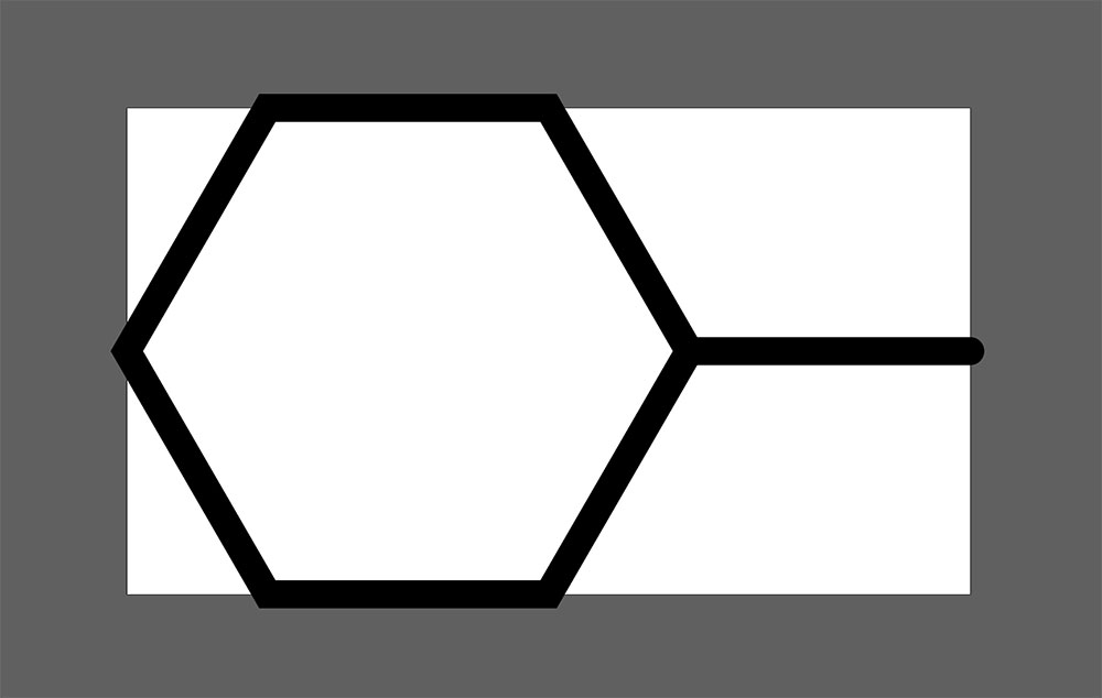
Designing a pattern with hexagonal tiles
Creating hexagonal tiles is a challenge in SVG, because tiles need to be defined as rectangular tiles.
To calculate the tile width and height, let’s use our first lesson on how to identify tiles.
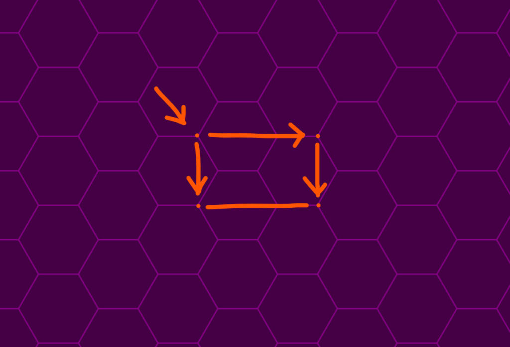
Looking at our hexagon pattern, I marked the left-most point of the hexagon and found matching spots horizontally and vertically. Using our eyes, we can tell the tile height will be equal to the height of one flat hexagon. The tile width is the width of the hexagon plus the distance of one side.
There are a few ways to determine these numbers. Actually measure the distance in a vector software like Illustrator or Google a formula (I chose the latter). The diameter is double the size of one side, so the width is the side multiplied by 3. The height is about 1.732 times bigger than the side and through a little trial and error I settled on some numbers that would have minimal rounding for the tile: 180×104.
Pattern tiles can handle decimals, but I prefer to create tiles where elements fall on whole pixels, as decimals can lead to thin lines or detailed designs blurring.
<pattern id="pttn" width="180" height="104" patternUnits="userSpaceOnUse">
   <g fill="none" stroke="#808" stroke-width="20">
      <path d="M90 0H30L0 52l30 52h60l30-52z"/>
      <path d="M120 52h60"/>
   </g>
</pattern>
<rect fill="url(#pttn)" width="100%" height="100%"></rect>
When you view the results closely, you may notice a little clipping in the tile. What’s wrong? The stroke of the hexagon crosses the left boundary and we need to compensate for that. The stroke also crosses the top and bottom boundaries, but in a way that matches and doesn’t need adjustment.
We have a few options to fix the right boundary and I’ll show you two strategies to tackle this challenge.
Solution 1
Recreate the hexagon or the portion of it that is clipping. You can draw up another hexagon path, but one way to clone shapes easily is the <use> element.
First, give the source element an id="" and reference it with an href="" attribute in our <use> element. Lastly, it will be placed at the same coordinates, so we need to add the tile width (180) to the X coordinate. The clipping no longer occurs. You can use this trick in most patterns that suffer from boundary clipping.
<svg xmlns="http://www.w3.org/2000/svg" xmlns:xlink="http://www.w3.org/1999/xlink" viewBox="0 0 400 240">
   <pattern id="p" width="180" height="104" patternUnits="userSpaceOnUse">
      <g fill="none" stroke="#808" stroke-width="15">
         <path id="a" d="M90 0H30L0 52l30 52h60l30-52z"/>
         <path d="M120 52h60"/>
         <use href="#a" x="180"/>
      </g>
   </pattern>
   <rect fill="url(#p)" width="100%" height="100%"></rect>
</svg>
Note: if your not using HTML 5, you must include the xmlns:xlink="http://www.w3.org/1999/xlink" declarative attribute in the SVG element for the <use> element to work.
Solution 2
The first solution is useful in many situations, but sometimes, it’s more elegant to position your elements in a way that avoids boundary clipping altogether.
We can simply place the hexagon in the horizontal center to avoid the same clipping issues we experienced in our first pattern.
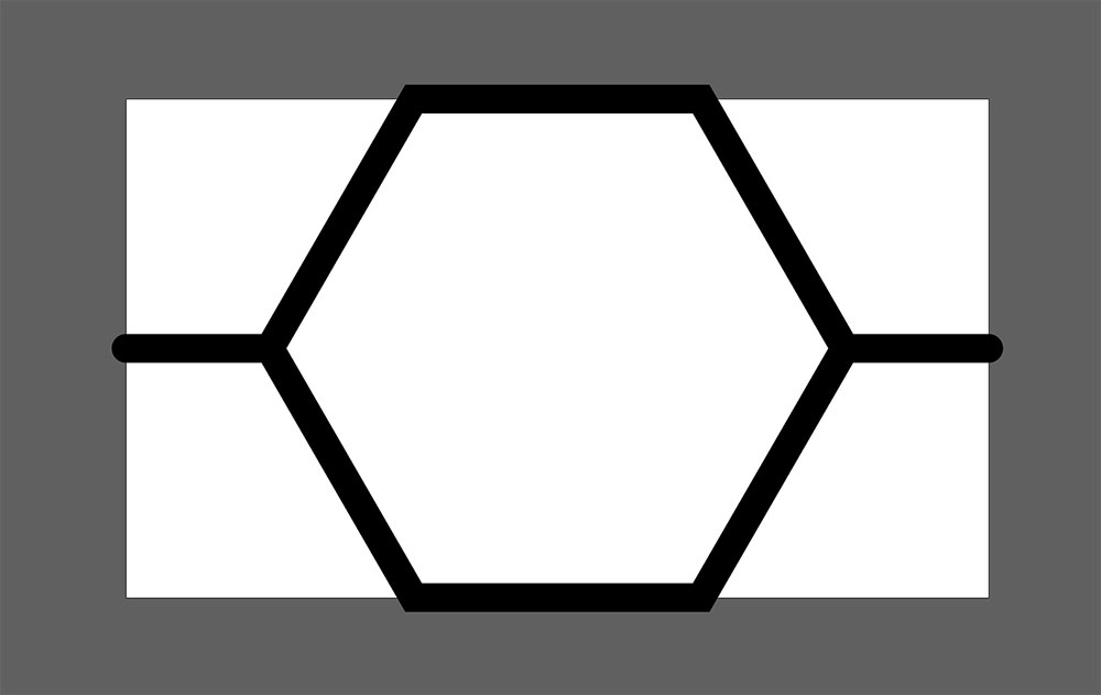
Here is the pattern code to this solution:
<pattern id="pttn" width="180" height="104" patternUnits="userSpaceOnUse">
   <g fill="none" stroke="#808" stroke-width="15">
      <path d="M120 0H60L30 52l30 52h60l30-52z"/>
      <path d="M150 52h30"/>
      <path d="M0 52h30"/>
   </g>
</pattern>
You can optimize the paths by merging them into a single element, removing the need for the g element:
<pattern id="pttn" width="180" height="104" patternUnits="userSpaceOnUse">
      <path stroke="#808" stroke-width="15" d="M120 0H60L30 52l30 52h60l30-52zM150 52h30M0 52h30" fill="none"/>
</pattern>
Designing a large organic doodle pattern
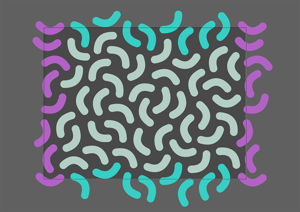
Instead of creating a new pattern, let’s dissect and reverse engineer a pattern that I grabbed from an SVGBackgrounds.com pattern collection. This time we’ll choose an organic doodle pattern where the shapes feel randomly placed.
We already know how to identify the tile, let’s start there.
If we kept all the shapes away from the boundary, the tile seams would be obvious. In this style of design, it’s important that all attributes get distributed evenly or your eye will get drawn to unique spots of the element.
I moved a single doodle element out of place and your eye gets drawn to the ripple in the resulting pattern.
This applies to all aesthetic features from colors, size, spacing, shape, quantity, and placement, as demonstrated above. When a pattern has one big shape, your eye gets drawn to that. When one color stands out in particular, your eyes notice those repetitions much easier.
To hide the seams of a pattern, aim to have an even frequency and distribution of design elements.
Next let’s check out the edges. I color-coated shapes that extend past the boundaries. Note that you can reach for the <use> element to clone the entire pink section and do the same for the sky blue section.
Making a design like this requires vector software like Illustrator or Inkscape. You’d likely place the edge pieces first, like a puzzle and then find natural placements for the other shapes to fill the canvas.
In any case, you will probably need to adjust pieces multiple times to get it just right. If you need to move an edge piece, make sure to translate the opposite edge piece in the same manner.
You could create a pattern right in Illustrator for export, but hand coding the <pattern> element is necessary to achieve a highly optimized SVG.
If you dissect the pattern’s code, you’ll notice the <use> elements clone the edge pieces as noted above. You can also tell decimals were removed from the paths because organic shapes don’t rely on precision. I wrote in depth about SVG optimization, if you’d like to learn other tricks to reduce filesize.
<svg xmlns='http://www.w3.org/2000/svg' viewBox='0 0 800 600'>
    <rect fill='#46315d' width='800' height='600' />
        <pattern id='c' width='800' height='600' patternUnits='userSpaceOnUse'
            patternTransform='scale(.4)'>
            <g fill='none' stroke='#735098' stroke-width='30' stroke-linecap='round'>
                <path
                    d='M109 57c0 41 20 60 60 60M439 128c40-6 56-28 51-68M523 138c35 21 61 14 82-20M405 294c-23 34-17 61 16 84M445 328c38-15 50-40 36-78M511 347c37-17 47-43 30-80M626 391c26-31 23-59-8-84M581 359c-32 25-35 52-10 84M752 415c3-40-15-61-56-64M252 139c-40 0-60 20-60 60M762 545c-4-40-25-58-66-54M584 562c40 0 60-19 60-60M624 179c-37 18-46 44-28 80M167 247c-30 27-32 54-5 85M425 241c-38-12-63 1-74 40M343 366c-9-40-32-55-72-46M622 445c39 12 64-1 76-40M512 458c15 37 40 49 78 34M111 349c-39 11-53 34-43 74M189 385c4 41 26 58 66 54M     314 442 c0-41-20-60-60-60M90 478c38-13 50-38 36-76M682 281c28 29 56 29 84 0M760 113c-27 29-26 57 4 84M245 255c-36 18-44 45-26 80M275 33c-40-1-60 17-62 58M325 149c0-40-19-60-60-60M714 89c-39 11-53 35-42 74M727 243c-25-32-53-35-84-10M345 197c38-13 50-38 36-76M524 214c-20-36-46-43-82-24M81 225c41 0 60-19 60-60M300 264c5-41-12-62-52-67M162 548c-28-29-55-30-84-2M496 398c-38 13-51 37-38 76M356 543c-8-40-30-55-70-48M242 529c-11-39-35-53-74-42M378 413c-17 37-7 63 30 80M410 552c38 15 63 3 78-34' />
                <path id='a'
                    d='M5 325c40 8 63-8 70-48M39 478c-33 24-37 51-13 84M-23 459c36-18 45-44 26-80M46 184c-36 18-45 44-28 80M-29 53c25 31 53 34 84 9M90 157c-23-34-50-39-84-16M-17-9c27 30 54 32 84 5M-17 591c27 30 54 32 84 5' />
                <path id='b'
                    d='M332-12c-13 39 0 63 38 76M578 13c-35 21-41 48-20 82M473 9c41 0 60-20 60-60M423 78c15-38 4-63-34-78M698 39c31-26 33-54 6-84M664-11c-36 19-44 46-25 82M163 65c11-39-3-63-42-74M208-26c36 19 62 12 82-24' />
                <use xlink:href='#a' x='800' />
                <use xlink:href='#b' y='600' />
            </g>
        </pattern>
    <rect fill='url(#c)' width='100%' height='100%' />
</svg>
How to apply SVG patterns to a webpage
Now that we can create our own patterns, we want to place the patterns as backgrounds on websites.
There are three approaches to adding SVG patterns to a website:
- SVG tiling: SVG file as the entire background
We’ve created SVG code with the<pattern>element which already handles the tiling and gives us advanced control, such as rotation, scaling, translation, and skew. - CSS tiling: SVG file as the tile
This method leans on CSS to handle the tiling. In this case the SVG should not have a<pattern>element wrapping the tile, but doesn’t change the rules for designing tiles. - Inline SVG for advanced control
If you prefer to inline your SVG to be able to manipulate the SVG design with CSS or JS, you can instead follow this tutorial on how to inline your background, as the next steps don’t apply.
Whether you choose SVG or CSS tiling, you will add your SVG pattern as a background-image via CSS.
First we’ll create a class and place the path to the SVG file as the value of the background-image property like so:
.your-class{
   background-image: url("/path/to/file.svg");
}
This is no different from adding a JPG as the background image.
Then there are a few other properties to consider to get the pattern to display the way you intend.
- Background-size: cover;
This declaration is good when stretching SVG across the entire screen, which is relevant if you’re using SVG tiling. - Background-size: auto;
This is a default value, which is necessary for CSS tiling, so you need this declaration if valueautois overridden for any reason. - Background-position: center;
This is optional, but useful if you’d like to center your pattern, as your pattern is anchored to the top left corner of the background container by default. - Background-repeat: no-repeat;
If we’re relying on the SVG for tiling, we don’t want any CSS tiling. But you don’t need this declaration if you usebackground-size: cover, which displays a single tile. - Background-repeat: repeat;
This is a default value, which is necessary for CSS tiling. Alternatively, you can also use the valuesrepeat-xorrepeat-y, if you only want a single column or row of tiles. - Background-attachment: scroll | fixed;
This property determines how the background displays with your content. A value ofscrollis the default and keeps the background scrolling with its container. A value offixedgives a parallax effect, where the background is attached to the screen and stays in place while you scroll.
What we’ve learned about SVG Patterns
We’ve gone over how to identify patterns and position elements within these tiles to ensure they display seamlessly.
We demonstrated the process of designing three unique SVG pattern styles, showcasing various techniques and strategies to help you create your own patterns.
Lastly, we talked about ways to apply these background patterns on websites using CSS.
Now you’re ready to go out and make your own patterns.
If you’d like pattern inspiration or to have loads of SVG patterns at your disposal, I’ve designed hundreds of free and paid SVG patterns. You can access them at:
Free SVG Generators
This article covers where you can find some of the best free SVG generators on the web.
What is an SVG generator?
An SVG generator is software that creates graphics to be output in the SVG image format. Creating graphics by hand can take hours, so the clear benefit is that SVG generators can do the same work in milliseconds.
These generators come with a simple user interface (UI), enabling you to iterate and make unique designs with the click of a button. For instance, changing the color of graphics by hand is relatively easy, but it can quickly get redundant when 20+ elements are involved. The challenge increases when you want to randomize colors or transition from one color to another in multiple steps. This logic is trivial to computers, which shred these tasks in the literal blink of an eye.
There is a wide variety of SVG generators that can create patterns, textures, shapes, and more. Some handle a specific task like creating blobs, while other generators manipulate a huge library of graphics.
Let’s review some of our favorite free SVG generators on the web, in each category.

SVG texture generator
Creating vector texture by hand is impossibly slow. This tool demonstrates just how powerful and useful SVG generators are. The SVG Textures tool creates randomized shapes and distributes hundreds of those shapes all over the page. You can control the shape, how many shapes, and how they spread. There is also a cool option to melt the neighboring blobs together. There are some more common controls to change colors, opacity, and zoom. Lastly you can export the results as a PNG or SVG.
- SVG Textures (free)

SVG background generator
Creating interesting backgrounds for websites is no easy task. SVGBackgrounds.com has a collection of over 200 backgrounds (48 free) that you can customize to fit your style, including abstract designs, complex gradients, and geometric patterns. One of the powerful features is the ability to input a few colors, and the generator calculates the spectrum of the colors between, creating dazzling color blends.
- SVG Backgrounds (free and paid)
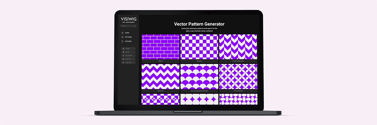
SVG pattern generator
SVGs make patterns on websites mesmerizing, as they add two distinct capabilities that regular pixel patterns can’t achieve without bloating file size: large patterns and off-center patterns. With an SVG pattern generator, you can quickly scale, rotate, colorize, and output the pattern to a website or software. The Vector Pattern Generator, linked below, has a feature to display some patterns as a fill or outline. In each case you can change the stroke-width to create unique patterns. SVG Backgrounds has many styles across 100+ patterns, including seamless 3d patterns, organic textures, and colorful repeating patterns.
- Vector Pattern Generator (free and paid)
- SVG Pattern Backgrounds (free and paid)
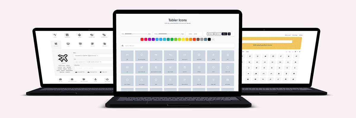
SVG icon generators
Icons are small graphics that pack a powerful punch on websites. Traditionally, icons are distributed in packs (or files) where you manage hundreds, if not thousands, of icons. Packs make finding the right icon a difficult task, where prepping the file for your website can be a hassle. SVG generators on the other hand make searching and prepping your desired icons easy. The generator UI can help you change the color, stroke width, icon size, filter the search results, and finally copy and paste the icon right into your website or software.
- Tabler Icons (free)
- Phosphor Icons (free)
- Jam Icons (free)
- Indie Icons (free)

SVG blob generator
Computers are great at creating randomness and generating randomized blob shapes is no exception. The blob maker app will help you create simple or complex blobs. You pick how rigid or bloated the blob is and how many points make up the blob (a number between 3-20). The SVG generator will connect and draw those points in a smooth fashion. Runner up, we SVG Backgrounds has a collection of pre-made blob shapes.
- Blobs.app (free)
- Simple SVG Blobs (free and paid)

SVG divider generator
Websites can look blocky, especially when you alternate sections with solid colors. One clever fix is to divide these sections with wavy and curly lines. Custom Shape Divider generates these interesting shapes quickly to help websites avoid the default rectangular look.
- Custom Shape Divider (free)
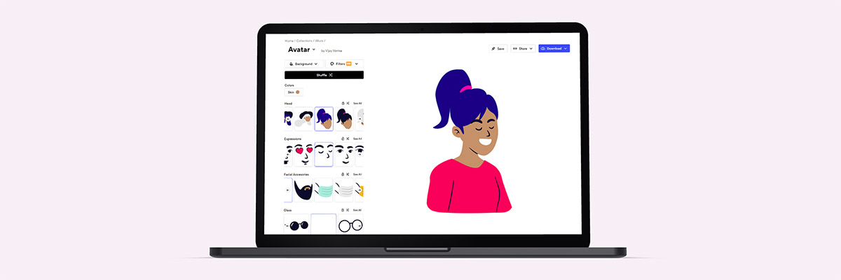
SVG illustration generator
Customizing illustrations is tricky, and generally requires professional design software and training to do more than change colors. That’s why Blush’s SVG generator is empowering to your average designer. It intuitively allows you to quickly mix and match illustration elements to create unique characters and scenes. While Blush has a giant collection of illustration scenes and styles, the free version limits the editing and output capabilities.
- Blush (free and paid)
SVG generators are here to stay
There are all sorts of SVG generators, and they certainly make our design tasks faster and our lives easier. SVG generators save us time by handling the redundant visual tasks that a computer can complete in under a second. In many cases, we conveniently don’t even need to fire up professional software to customize professional graphics.
We hope you discovered some new SVG generators and bookmarked them!
3 ways SVG can help websites look less blocky
The initial state of HTML elements are rectangles. While you can give HTML containers rounded corners to break up the square design, this only helps minimally. SVGs can drastically transform blocky webpages, hiding the fact that all the building blocks are four-sided.
Here are the 3 ways SVGs can help web pages look organic
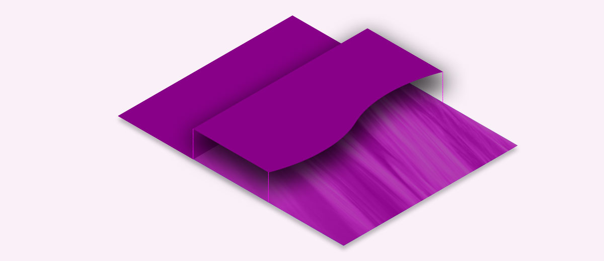
1) SVG Section dividers
When you give website sections a background color, by default the two neighboring sections are separated by a straight line. It doesn’t get much more boxy than that, unless we’re talking about a grid of evenly distributed boxes.
How to make section transitions less square:
Create a full-screen shape that will stretch from the left side of the screen all the way to the right. The shape and it’s background need to match the neighboring colors. This could be simple as matching the color of each section, but can work with a solid color over a photograph.
How to implement an SVG divider
To achieve this effect with CSS, we can give two images to a single background-image property. The first will be the SVG positioned to the top with a 100% width. The second with be the photo with a background-size: cover to fill the entire section.
.section-divider{
   background-image: url(<svg code>), url(/img.jpg);
   background-position: top center, 50%;
   background-size: 100%, cover;
   background-repeat: no-repeat;
}
Notice when two arguments are used for the background-image, you can give other background-image properties one value to affect both images or give two values to affect both in different ways.
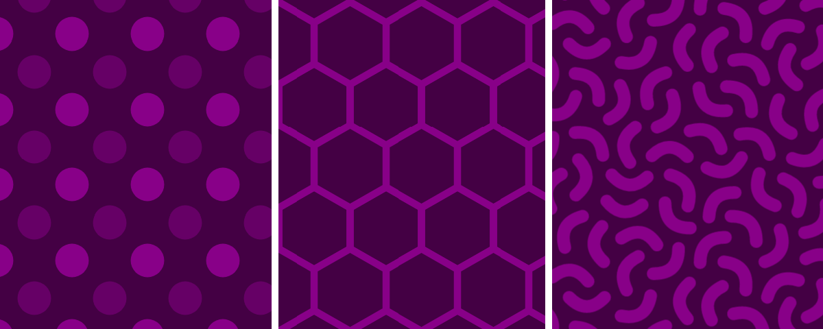
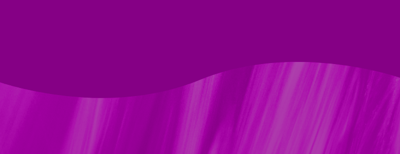
2) SVG backgrounds with angles or curves
Solid color backgrounds or repeating geometric patterns can emphasize how a web page is rectangular. Therefore, if we reach for designs that don’t line up with the screen, the boxy design isn’t as apparent. Curves work hardest to pull your eyes away from the square nature of the screen.
How to make backgrounds less square:
Choose backgrounds with curves or angles that contrast from the straight lines of the content, screen, or containers. Here are a few quick example backgrounds I pulled from SVGBackgrounds.com:

You can also use radial gradients or angled linear gradients to bring attention to various parts of the screen. If you overlap multiple gradients, you can mimic mesh gradients, which are not currently compatible with SVG at this time.
Lastly, if you select a repeating pattern, you can rotate them slightly, so everything doesn’t line up with the screen perfectly. You can additionally scale the SVG pattern large to deemphasize the symmetrical nature of patterns. You can get free SVG patterns with this Vector Pattern Generator.

3) SVG blobs, illustrations, and other shapes
Web design is built on the CSS box model, which naturally causes default content to be constrained by rectangular design. There is no need to escape the containers to achieve a less-blocky design. The trick is to keep the container’s background transparent, bringing the focus to the content’s irregular, curvy shapes.
How to make page elements less square:
Shapes and blobs can help de-emphasis the container, especially when the background image is transparent. There are three obvious elements that can pull off this tactic.
SVG blobs
Using blobs in one way or another has become a popular trend in web design. One way to use blobs is to place content right over it, making the blob like an organic container. Another way is placing blobs of various sizes in the background, which tends to hide straight lines and boxy containers.
SVG illustrations
Illustrations are naturally full of organic edges and shapes that break the rectangular mold. Images of illustrations are generally contained within a rectangular canvas, so you must ensure there is no background color to avoid the canvas from being noticeable. A great resource to find SVG illustrations is unDraw.
SVG shapes and icons
Using icons or shapes on your web pages can grab the users’ eyes, placing emphasis on elements that don’t use boxy design. I already wrote an entire article on where to get great SVG icons (and shapes). SVG icons and shapes are often aligned to content, but I’ve also seen them used as background elements, to lessen the uniformity that results from four-sided design.
Thinking outside the blocks
While everything you design for webpages starts with rectangular containers, you don’t need to settle with blocky design. Instead reach for SVGs to think outside of the box. You can always rely on section dividers, backgrounds, or shapes. Don’t be square!
How to add SVGs with CSS (background-image)
There are TWO methods for displaying SVG images as a CSS background image:
- Link directly to an SVG file
.your-class {
   background-image: url( '/path/image.svg' );
}- Placing SVG code as the source.
.your-class {
   background-image: url( "data:image/svg+xml,%3Csvg xmlns='http://www.w3.org/2000/svg' viewBox='0 0 600 200'%3E%3Cpath d='M10 10h123v123H10z'/%3E%3C/svg%3E" );
}
Notice with this method we have to treat the SVG code before it will work. In the example, we convert the SVG to a Data URI. You could even convert it to Base64, but that will result in a messier, longer code blob. It is a best practice to avoid Base64 in this case.
Tip: Use this SVG to CSS converter tool to quickly convert your SVG code into a data URI.
After you place your file path or SVG code into the background-image property, you can further tweak how the background displays. You see, the great thing about using an SVG as a CSS background-image is that they can be styled with CSS background properties.
Don’t miss any SVG freebies: customizable backgrounds, icons, and more: get freebies
The CSS background-image properties
Let’s review all the properties related to background-image and what they do.
- Background-attachment:
Example values: scroll; fixed; local;
The attachment specifies how the background moves relative to the user’s screen. When the user scrolls, the background can scroll along with a given section, or stay put (fixed).
- Background-position:
Example values: center; top left; 50% 50%; right 30px bottom 15px;
Thebackground-positiondetermines where the image is displayed within its container. The center keyword is great with large backgrounds and at making patterns symmetrical. With smaller backgrounds, you may reach for a combo of keywords and lengths to place the background image more precisely. - Background-size:
Example values: cover; contain; 500px 250px; auto;
This controls how big or small the image displays. A value ofcoverforces the image to fill its entire containing element in proportion, and either the excess width or height will get clipped. A value ofcontainis similar in that it fills its container in proportion, but without clipping. You can also provide a specific width and height value. - Background-repeat:
Example values: no-repeat; repeat; repeat-x;
Thebackground-repeatproperty allows you to tile the background image into a pattern. - Background-color:
Example values: red; #F00; rgb(0,255,165);
SVGs are a transparent image format and if the SVG elements do not cover the entire viewBox, the background color will be visible behind your SVG. - Background-origin:
Example values: border-box; padding-box; content-box;
The origin determines the boundary of the background’s container.Border-boxwill stretch the background area for the entire container, while thepadding-boxandcontent-boxvalues shrink the background area within the border and inside the padding respectively.
- Background-clip:
Example values: border-box; padding-box; content-box;
Similar tobackground-origin, this property defines the background area, with one difference: the background doesn’t resize, but instead crops the background image to fit in the assigned boundary.
- Background-blend-mode:
Example values: multiply; screen; overlay, color-dodge, color;
This property blends the colors of the target background with what is visible behind the target element, blending into a single colorful result. The blend modes are essentially the browser version of Photoshop’s blending modes.
Layering multiple background images
Background-image can hold multiple background image layers to achieve cool effects. To create these image layers, comma-separate each image value in a single background-image property. Then when you use any related background properties, comma-separate those varied values to coincide with the images, or instead use a single value which will apply to all images the same.
background-image:
   url( '/path/image-1.svg' ),
   url( '/path/image-2.svg' ),
   url( '/path/image-3.svg' );
You can mix images, SVG data URIs, and CSS gradients. But you need to overlap images with transparency or take advantage of the background-blend-mode discussed above. Otherwise you will only see one background. The first image is on top of the background stack.
Let’s mix a few backgrounds now, and see what we get. First I headed over to the homepage of SVGBackgrounds.com to find a few quick backgrounds to layer together. Here is the code and results:
<div id="multi-bg"> </div>
<style>
   #multi-bg{
      height: 300px;
      display: block;
      background-color: #808;
      background-image:
         url("data:image/svg+xml,%3Csvg xmlns='http://www.w3.org/2000/svg' viewBox='0 0 1600 900'%3E%3Cpolygon fill='%23cc3f47' points='957 450 539 900 1396 900'/%3E%3Cpolygon fill='%23b3373e' points='957 450 872.9 900 1396 900'/%3E%3Cpolygon fill='%23c8364e' points='-60 900 398 662 816 900'/%3E%3Cpolygon fill='%23b02f44' points='337 900 398 662 816 900'/%3E%3Cpolygon fill='%23c22f55' points='1203 546 1552 900 876 900'/%3E%3Cpolygon fill='%23ab294b' points='1203 546 1552 900 1162 900'/%3E%3Cpolygon fill='%23bb285c' points='641 695 886 900 367 900'/%3E%3Cpolygon fill='%23a52351' points='587 900 641 695 886 900'/%3E%3Cpolygon fill='%23b32362' points='1710 900 1401 632 1096 900'/%3E%3Cpolygon fill='%239f1f57' points='1710 900 1401 632 1365 900'/%3E%3Cpolygon fill='%23aa2068' points='1210 900 971 687 725 900'/%3E%3Cpolygon fill='%23971c5d' points='943 900 1210 900 971 687'/%3E%3C/svg%3E"),
         url("data:image/svg+xml,%3Csvg xmlns='http://www.w3.org/2000/svg' width='400' height='200' viewBox='0 0 160 80'%3E%3Cg fill='%23FFF' fill-opacity='0.2'%3E%3Cpolygon points='0 10 0 0 10 0'/%3E%3Cpolygon points='0 40 0 30 10 30'/%3E%3Cpolygon points='0 30 0 20 10 20'/%3E%3Cpolygon points='0 70 0 60 10 60'/%3E%3Cpolygon points='0 80 0 70 10 70'/%3E%3Cpolygon points='50 80 50 70 60 70'/%3E%3Cpolygon points='10 20 10 10 20 10'/%3E%3Cpolygon points='10 40 10 30 20 30'/%3E%3Cpolygon points='20 10 20 0 30 0'/%3E%3Cpolygon points='10 10 10 0 20 0'/%3E%3Cpolygon points='30 20 30 10 40 10'/%3E%3Cpolygon points='20 20 20 40 40 20'/%3E%3Cpolygon points='40 10 40 0 50 0'/%3E%3Cpolygon points='40 20 40 10 50 10'/%3E%3Cpolygon points='40 40 40 30 50 30'/%3E%3Cpolygon points='30 40 30 30 40 30'/%3E%3Cpolygon points='40 60 40 50 50 50'/%3E%3Cpolygon points='50 30 50 20 60 20'/%3E%3Cpolygon points='40 60 40 80 60 60'/%3E%3Cpolygon points='50 40 50 60 70 40'/%3E%3Cpolygon points='60 0 60 20 80 0'/%3E%3Cpolygon points='70 30 70 20 80 20'/%3E%3Cpolygon points='70 40 70 30 80 30'/%3E%3Cpolygon points='60 60 60 80 80 60'/%3E%3Cpolygon points='80 10 80 0 90 0'/%3E%3Cpolygon points='70 40 70 60 90 40'/%3E%3Cpolygon points='80 60 80 50 90 50'/%3E%3Cpolygon points='60 30 60 20 70 20'/%3E%3Cpolygon points='80 70 80 80 90 80 100 70'/%3E%3Cpolygon points='80 10 80 40 110 10'/%3E%3Cpolygon points='110 40 110 30 120 30'/%3E%3Cpolygon points='90 40 90 70 120 40'/%3E%3Cpolygon points='10 50 10 80 40 50'/%3E%3Cpolygon points='110 60 110 50 120 50'/%3E%3Cpolygon points='100 60 100 80 120 60'/%3E%3Cpolygon points='110 0 110 20 130 0'/%3E%3Cpolygon points='120 30 120 20 130 20'/%3E%3Cpolygon points='130 10 130 0 140 0'/%3E%3Cpolygon points='130 30 130 20 140 20'/%3E%3Cpolygon points='120 40 120 30 130 30'/%3E%3Cpolygon points='130 50 130 40 140 40'/%3E%3Cpolygon points='120 50 120 70 140 50'/%3E%3Cpolygon points='110 70 110 80 130 80 140 70'/%3E%3Cpolygon points='140 10 140 0 150 0'/%3E%3Cpolygon points='140 20 140 10 150 10'/%3E%3Cpolygon points='140 40 140 30 150 30'/%3E%3Cpolygon points='140 50 140 40 150 40'/%3E%3Cpolygon points='140 70 140 60 150 60'/%3E%3Cpolygon points='150 20 150 40 160 30 160 20'/%3E%3Cpolygon points='150 60 150 50 160 50'/%3E%3Cpolygon points='140 70 140 80 150 80 160 70'/%3E%3C/g%3E%3C/svg%3E"),
         url("data:image/svg+xml,%3Csvg xmlns='http://www.w3.org/2000/svg' width='100%25' height='100%25' viewBox='0 0 1600 800'%3E%3Cg %3E%3Cpolygon fill='%23740074' points='1600 160 0 460 0 350 1600 50'/%3E%3Cpolygon fill='%235f005f' points='1600 260 0 560 0 450 1600 150'/%3E%3Cpolygon fill='%234b004b' points='1600 360 0 660 0 550 1600 250'/%3E%3Cpolygon fill='%23360036' points='1600 460 0 760 0 650 1600 350'/%3E%3Cpolygon fill='%23220022' points='1600 800 0 800 0 750 1600 450'/%3E%3C/g%3E%3C/svg%3E");
      background-repeat: no-repeat;
      background-size: cover;
      background-position: bottom center, 50%, 50%;
   }
</style>
Pretty? No.
BUT, this technique prevents the need to layer div containers to achieve a layer effect. Let’s try again, this time to make a simpler one that looks useable. Let’s place a pattern over a cool image texture.
Much better!
I could definitely see something more like this being used in a real-world project. Subtle backgrounds are always nice.
Wrapping up about SVGs in CSS background-images
We looked at how to add SVGs into the CSS property background-image. With all the related background properties and the fact you can layer backgrounds, there is little that can’t be achieved. This way of adding website backgrounds is powerful.
The fastest icons in the Wild Wild Web
In this article, I’m going to show you the fastest way to integrate icons into your web projects. Hint, it’s literally click and paste.
But let me disappoint you first. You’re not going to find the fastest resources with a quick google search. In fact, when you look for icons to use on your website, a search will bring you to some well known sites and icon sets:
- The Noun Project
- FlatIcon
- Icons8
- Icon Finder
- Freepik
- FontAwesome
BUT, they come with barriers that we intend to avoid.
What do we want?
The SVG code!
When do we want it?
Instantly!
6 rules for faster icons
Not all icon collections are built the same. Some icon collections are large and some are small. Some are built as PNGs, SVGs, icon fonts, icon sprites, or left in a design file like Adobe Illustrator. But for your icons to travel at the speed of light, they have to adhere to a few rules. 6 very specific rules.
Let me spell out what we are looking for:
- SVG icons and not JPG/PNG, ZIPs, Fonts, or design files
- No software required to customize SVG (color with CSS)
- Files create extra steps
- No arbitrary barriers, like registration
- Barriers slow you down, but we have a need for speed
- Barriers slow you down, but we have a need for speed
- No cost or attribution required
- Paywalls are a barrier, attribution adds another step
- Paywalls are a barrier, attribution adds another step
- A search mechanism to quickly find relevant icons
- Looking at a grid of a thousand icons is slow
- Looking at a grid of a thousand icons is slow
- A sizeable icon set with consistent design
- If the icons don’t match in style, they’ll look bad together
- If the icons don’t match in style, they’ll look bad together
- A way to click and paste code
- Pasting code into HTML is fast and easy
Before I get to the list of good sites, I must stress I’m going to be strict. If you fail to meet one of those bullet points, you’re off the list.
For instance, Google Fonts has an impressive free icon tool. There is a huge collection of searchable SVG icons, no registration required, but it fails. It fails because there is no simple way to copy-and-paste the SVG code. You can download the icon as an SVG or add the icons as a font, but neither of these methods meet the criteria for being lightning quick.
I researched far and wide to curate this list of qualifying icon websites. I had to visit hundreds of websites, click around, test icons, read licenses, type in searches, and test the output. When you click a button: some sites copy the code, some open a modal, and some proceed to download a file. I unwittingly downloaded hundreds of icon files testing out websites to see what method they used by default. But I did this all for you.
Let’s get right to the list, then I’ll break down the steps to add an icon to your next project.
18 lightning fast SVG icon sites:
- Boxicons (1525)
- Tabler Icons (1298)
Top Pick - Remix Icon (1135×2)
- Jam Icons (940)
Top Pick - Phosphor Icons (894×3)
Top Pick - Glyphs (860+)
- Teeny Icons (720+)
- System UIcons (420)
- Pixel Art Icons (350+)
- Radix Icons (400)
- Akar Icons (350)
- Material Line Icons (250)
- Hero Icons (230×2)
- Indie Icons (200+)
I made this - Mono Icons (177)
- IconPark (2400×4)
- Bootstrap Icons (1370)
- Iconmonstrr (4260+)
How to place your icons into your web project quickly
Now that you know WHERE to find good icons for your website or web-based app, it’s time to delve into the secret world of icon placement. The process is as easy as 1-2-3.
- Pick your icon
- Paste your icon
- Style your icon
Let’s look at each step.
Step 1: Pick and copy your icon
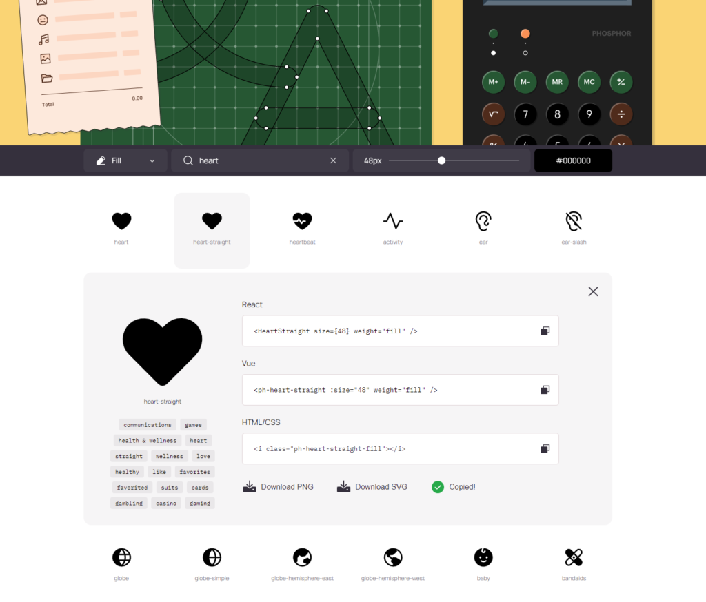
Up to this point, you have been preparing for this very moment. After visiting an icon site from the list above, you can search for the icon you need. In my case, I searched for a “crown” icon.
Then click to copy the icon SVG code.
The sites I provided are generally intuitive, but it may take a few seconds to locate the correct copy button on your first visit. Most sites have a copy mechanism that uses some variation of a “Copy SVG code” button, or clicking the icon directly, or even clicking a blob of SVG code.
Now that you have the SVG code in your clipboard, you’re ready to proceed.
Step 2: Paste your icon
This SVG code you are about to paste is powerful. Do you think I’m being silly or exaggerating? No, I’m serious. To the untrained eye, it looks like a blob of code. But you can paste this directly into software like Illustrator or Figma. That’s powerful, but for today you’re right: it’s just a blob of code.
Where to paste: We need to paste this into HTML. The great thing is that any tool you use to build your website likely outputs everything to HTML. Writing in PHP or JS? You’ll output to HTML. Are you using a page builder like Webflow or Elementor? You’ll output to HTML. Writing a blog post on WordPress, use an HTML element to—you guessed it—output to HTML!
Type CTRL+V or Command+V to paste the code in the desired place.
Bonus: to optimize the SVG code blob before you paste, I often use SVG OMG. It can shed 10-30% of the unnecessary code. You can also use it to inline the styles or deal with whitespace. We’ll talk about SVG optimization further another day.
Step 3: Style your icon
The code blob is SVG code. And if you stare at it long enough, it’s almost readable.

When you know what attributes you are looking for, it makes it easy to edit. Let’s spell out the two most important ones: color and size. Some of the icon sites have a color/size editor like Tabler Icons, Phosphor Icons, and the one I made (Visiwig.com) if you would rather not mess with the code.
Changing the color:
The two attributes that affect the icon color are fill and stroke. Generally speaking, if the icons are solid, you’ll want to change the fill color. If the icon is outlined, you’ll want to change the stroke color and set the fill to none (fill=”none”). You can use color names like “red” or input hex codes like #F00.
<!-- Red fill (fill="#F00") -->
<svg xmlns="http://www.w3.org/2000/svg" viewBox="-2 -4 24 24" width="40" height="40">
  <path fill="#F00" d="M9.293 1.55l.707.708.707-.707a5 5 0 117.071 7.071l-7.07 7.071a1 1 0 01-1.415 0L2.222 8.622a5 5 0 117.07-7.071z"/>
</svg>

<!-- Purple outline (stroke="#808" fill="none") -->
<svg xmlns="http://www.w3.org/2000/svg" viewBox="-2 -4 24 24" width="40" height="40">
  <path stroke="#808" fill="none" d="M9.293 1.55l.707.708.707-.707a5 5 0 117.071 7.071l-7.07 7.071a1 1 0 01-1.415 0L2.222 8.622a5 5 0 117.07-7.071z"/>
</svg>You could also control the color via CSS if you prefer, like so:
<!-- Change via CSS (class="icon") -->
<svg class="icon" xmlns="http://www.w3.org/2000/svg" viewBox="-2 -4 24 24" width="40" height="40">
  <path d="M9.293 1.55l.707.708.707-.707a5 5 0 117.071 7.071l-7.07 7.071a1 1 0 01-1.415 0L2.222 8.622a5 5 0 117.07-7.071z"/>
</svg>

<style>
   .icon{
      fill: blue;
      stroke: black;
   }
</style>If you desire to change the background color, you’ll want target the SVG or icon container with a background color:
<!-- Change the background color inline -->
<svg class="icon" xmlns="http://www.w3.org/2000/svg" viewBox="-2 -4 24 24" width="40" height="40" style="background-color:yellow;">
  <path d="M9.293 1.55l.707.708.707-.707a5 5 0 117.071 7.071l-7.07 7.071a1 1 0 01-1.415 0L2.222 8.622a5 5 0 117.07-7.071z"/>
</svg>

<!-- Change background color with CSS -->
<style>
   .icon{
      background-color: yellow;
   }
</style>Editing the size:
There are a few factors that affect the icon size: width and height of the SVG or container, as well as the stroke-width for outlined icons.
On the above color demo’s the size was always 40px (the unit is implied). Let’s change that with both the inline method and via CSS and see what we get:
<!-- Change the background color inline -->
<svg xmlns="http://www.w3.org/2000/svg" viewBox="-2 -4 24 24" width="60" height="60">
  <path d="M9.293 1.55l.707.708.707-.707a5 5 0 117.071 7.071l-7.07 7.071a1 1 0 01-1.415 0L2.222 8.622a5 5 0 117.07-7.071z"/>
</svg>

<!-- Change background color with CSS -->
<svg class="icon" xmlns="http://www.w3.org/2000/svg" viewBox="-2 -4 24 24" >
  <path d="M9.293 1.55l.707.708.707-.707a5 5 0 117.071 7.071l-7.07 7.071a1 1 0 01-1.415 0L2.222 8.622a5 5 0 117.07-7.071z"/>
</svg>

<style>
   .icon{
      width: 100px;
      height: 100px;
      fill: red;
   }
</style>Wrapping up the project
We went over the basics to quickly find a suitable icon and get it into our web project in a flash. After you go through the process a few times, you’ll discover how truly fast you can add a nice touch to your design. All it takes is a quick search, a click and paste, and a little customization to get it just right.
Lastly, while no attribution is required, it doesn’t hurt to show your love and support by sharing them on social media or crediting the authors somewhere.

Hey, I'm Matt , the creator behind SVG Backgrounds. I produce free and paid resources every month, sign up for alerts.