3 ways SVG can help websites look less blocky
By Matt Visiwig  Sep 29, 2021
The initial state of HTML elements are rectangles. While you can give HTML containers rounded corners to break up the square design, this only helps minimally. SVGs can drastically transform blocky webpages, hiding the fact that all the building blocks are four-sided.
Here are the 3 ways SVGs can help web pages look organic
1) SVG Section dividers
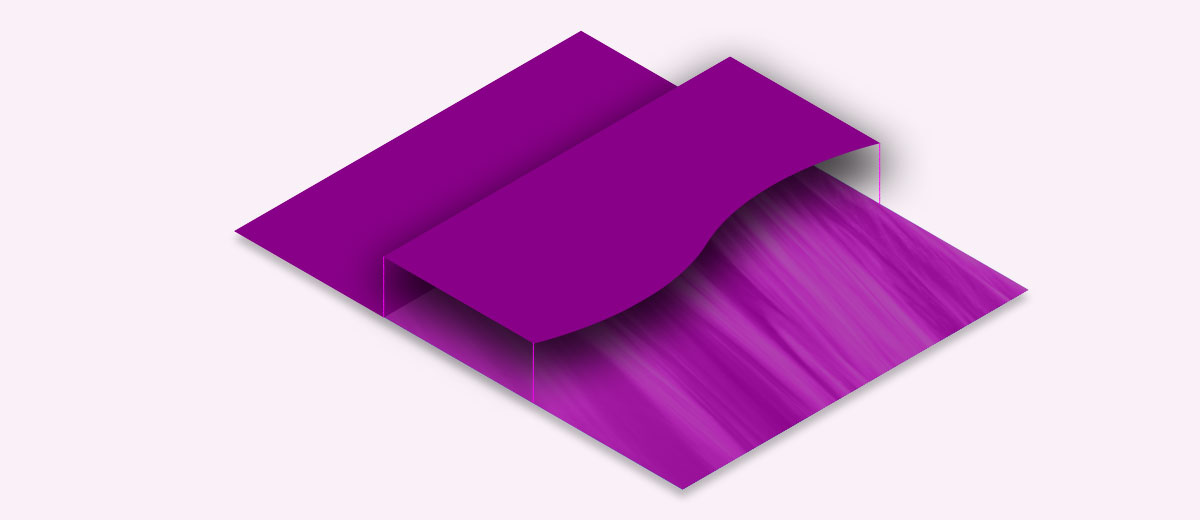
When you give website sections a background color, by default the two neighboring sections are separated by a straight line. It doesn’t get much more boxy than that, unless we’re talking about a grid of evenly distributed boxes.
How to make section transitions less square:
Create a full-screen shape that will stretch from the left side of the screen all the way to the right. The shape and it’s background need to match the neighboring colors. This could be simple as matching the color of each section, but can work with a solid color over a photograph.
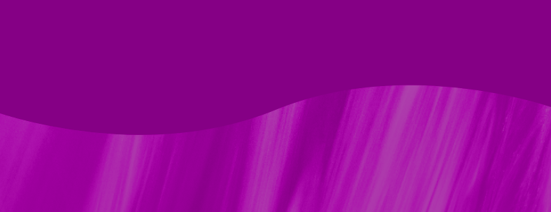
How to implement an SVG divider
To achieve this effect with CSS, we can give two images to a single background-image property. The first will be the SVG positioned to the top with a 100% width. The second with be the photo with a background-size: cover to fill the entire section.
.section-divider{
   background-image: url(<svg code>), url(/img.jpg);
   background-position: top center, 50%;
   background-size: 100%, cover;
   background-repeat: no-repeat;
}
Notice when two arguments are used for the background-image, you can give other background-image properties one value to affect both images or give two values to affect both in different ways.
2) SVG backgrounds with angles or curves
Solid color backgrounds or repeating geometric patterns can emphasize how a web page is rectangular. Therefore, if we reach for designs that don’t line up with the screen, the boxy design isn’t as apparent. Curves work hardest to pull your eyes away from the square nature of the screen.
How to make backgrounds less square:
Choose backgrounds with curves or angles that contrast from the straight lines of the content, screen, or containers. Here are a few quick example backgrounds I pulled from SVGBackgrounds.com:
You can also use radial gradients or angled linear gradients to bring attention to various parts of the screen. If you overlap multiple gradients, you can mimic mesh gradients, which are not currently compatible with SVG at this time.
Lastly, if you select a repeating pattern, you can rotate them slightly, so everything doesn’t line up with the screen perfectly. You can additionally scale the SVG pattern large to deemphasize the symmetrical nature of patterns. You can get free SVG patterns with this Vector Pattern Generator.
3) SVG blobs, illustrations, and other shapes
Web design is built on the CSS box model, which naturally causes default content to be constrained by rectangular design. There is no need to escape the containers to achieve a less-blocky design. The trick is to keep the container’s background transparent, bringing the focus to the content’s irregular, curvy shapes.
How to make page elements less square:
Shapes and blobs can help de-emphasis the container, especially when the background image is transparent. There are three obvious elements that can pull off this tactic.
SVG blobs
Using blobs in one way or another has become a popular trend in web design. One way to use blobs is to place content right over it, making the blob like an organic container. Another way is placing blobs of various sizes in the background, which tends to hide straight lines and boxy containers.
SVG illustrations
Illustrations are naturally full of organic edges and shapes that break the rectangular mold. Images of illustrations are generally contained within a rectangular canvas, so you must ensure there is no background color to avoid the canvas from being noticeable. A great resource to find SVG illustrations is unDraw.
SVG shapes and icons
Using icons or shapes on your web pages can grab the users’ eyes, placing emphasis on elements that don’t use boxy design. I already wrote an entire article on where to get great SVG icons (and shapes). SVG icons and shapes are often aligned to content, but I’ve also seen them used as background elements, to lessen the uniformity that results from four-sided design.
Thinking outside the blocks
While everything you design for webpages starts with rectangular containers, you don’t need to settle with blocky design. Instead reach for SVGs to think outside of the box. You can always rely on section dividers, backgrounds, or shapes. Don’t be square!
Hey, I'm Matt , the creator behind SVG Backgrounds. I produce free and paid resources every month, sign up for alerts.