3 ways to use SVG blobs on your website (CSS)
By Matt Visiwig  Apr 27, 2023
In the last tutorial I showed you how to manually make your own blob and quickly export it. We glossed over how to integrate it onto your website.
Today let’s focus on that last part and demonstrate three ways to use blobs in your designs.
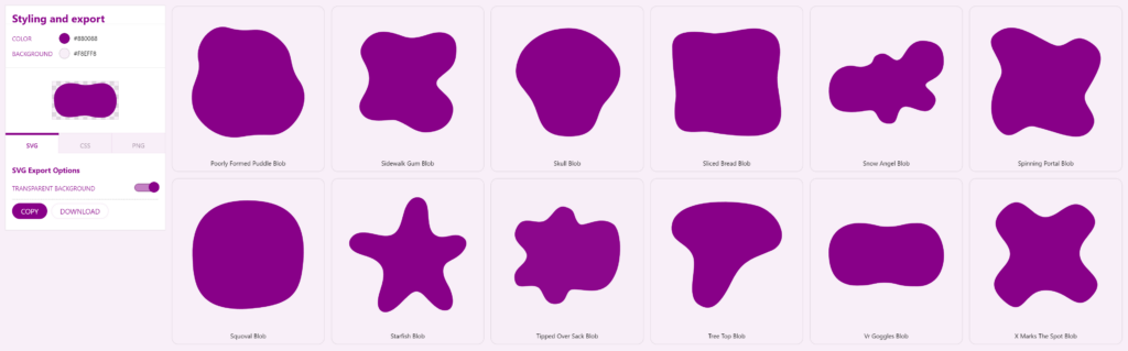
So you made a blob in Figma, Illustrator or whatnot, and if you haven’t, you can quickly grab one from the many SVG blob generators out there. I’m grabbing one from my website SVGBackgrounds.com > SVGs > Simple blobs, there’s some free ones.
We’re going to:
- Add a blob as a background
- Mask an image with a blob
- Divide two sections with a blob curve
Let’s get to it!
Adding a blob as a simple background
When you give your container a background color, it shows its rectangular boundaries which is looks boxy. Instead, if we place a blob as the background, it will look more organic and curvy.
The way to do that is with the CSS property background-image and the specify your image.svg as the value. Unfortunately with image files, you then have to upload your image to the server and type out the correct path.
Seeing as SVG is code, it’s quicker to paste a data URI as the image source instead. Link in the description for those who need to convert your inline SVG to a data URI.
/* Image file */
background-image: url(your-path/your-image.svg);

/* Data URI */
background-image: url('data:image/svg+xml,<svg xmlns="http://www.w3.org/2000/svg" viewBox="0 0 2000 1155" fill="%23808"><path d="M968.99 1033c-187.45.85-174.59 47.22-449 48-352 1-463-239-463-548 0-273.09 190-474 496-472 277.28 1.81 277.22 60.83 470 57 252-5 217.88-56.12 487-57 305-1 431 290 433 526s-117.08 502.4-432 507c-342 5-322-62-542-61Z"></path></svg>');
You’ll likely need to specify background-repeat: no-repeat because repeating the background is the default and we no longer live in the 90s.
We need a few other CSS properties to ensure the blob doesn’t get clipped. We can use background-size: contain so both the blob’s width and height are no bigger then the container. I’m also using background-position: center to center the blob.
I recommend giving the container some padding to help the content stay with in the blob.
background-image: url('data:image/svg+xml,<svg xmlns="http://www.w3.org/2000/svg" viewBox="0 0 2000 1155" fill="%23808"><path d="M968.99 1033c-187.45.85-174.59 47.22-449 48-352 1-463-239-463-548 0-273.09 190-474 496-472 277.28 1.81 277.22 60.83 470 57 252-5 217.88-56.12 487-57 305-1 431 290 433 526s-117.08 502.4-432 507c-342 5-322-62-542-61Z"></path></svg>');
background-repeat: no-repeat;
background-size: contain;
background-position: center;
padding: 30px;
Pro-tip: you can layer multiple backgrounds to make a composition with a comma separated list. The first background listed is on top. And you can manipulate all the backgrounds with a single background property (center them all) or give them all unique values—again with commas. Do not give less unique values then the number of backgrounds you’re layering.
Dividing a section to avoid boxy looking design
This technique isn’t all that different from the first, however we’ll want the blob background to be clipped in a way that the the blob edge is showing on a single boundary (top, bottom, left, or right).
Since we want the blob clipped, we’re going to make the blob’s background-size bigger then 100% with the keyword cover to stretch your blob to fill the entire container or a literal value such as 150%. Then we’ll position it to a side with background-position: 50% 500px. We’ll play around with these values to work with the given blob shape.
.class{
    background-image: url('data:image/svg+xml,<svg xmlns="http://www.w3.org/2000/svg" viewBox="0 0 2000 1155" fill="%23808"><path d="M968.99 1033c-187.45.85-174.59 47.22-449 48-352 1-463-239-463-548 0-273.09 190-474 496-472 277.28 1.81 277.22 60.83 470 57 252-5 217.88-56.12 487-57 305-1 431 290 433 526s-117.08 502.4-432 507c-342 5-322-62-542-61Z"></path></svg>');
    background-repeat: no-repeat;
    background-size: 150%;
    background-position: 50% 400px;
}
TOP DIV
BOTTOM DIV
In this example, I purposefully made the bottom div the wrong color, so the technique is visible. Ideally the bottom div would match the blob color (purple in this case) to hide the container shape, making the transition seamless between the blob and neighboring container.
If we used the same blob from the first technique, we have a limited ability to position the blob. We can get it looking good, but it’s not responsive, so a change in the container size may shift the blob out of view.
To combat this, I’d prepare the SVG differently, instead positioning the blob, so it’s clipped in the SVG and position the SVG background based on the clipped side. For example, if the blob is clipped at the bottom, like in the image below, I’d bottom-align the background-image with background-position: bottom center.
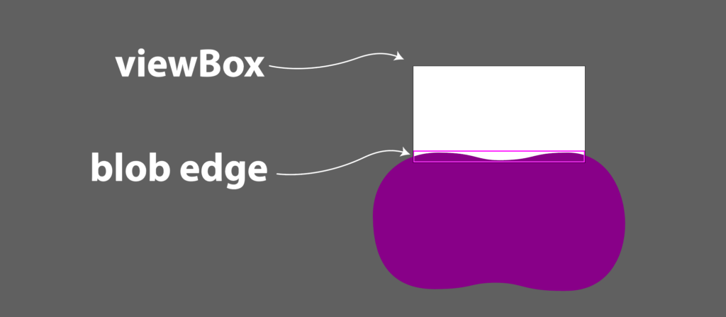
You’ll notice, most of the blob falls outside the viewBox. We are only interested in the top edge of the blob. Take notice of how I positioned the blob to fill the entire width.
Masking an image with a blob
In early web design, images were rectangles. To get rounded corners you had use your image editor, like PhotoShop, before bringing it into your web page. Now we have the lovely CSS property Border-radius to make this a cinch.
We can take this one step further and give images a more organic blob shape, using a mask.
There two ways to go about this, mask and clip-path.
I prefer using the CSS mask because it’s straightforward, as long as you’re ok with using vendor prefixes, because Chromium browsers need -webkit- preceding the mask property. But it’s well worth it because you can aslo control the size and positioning of the mask.

img.frog-mask{
  -webkit-mask: url('<dataURI>') center / contain no-repeat;
          mask: url('<dataURI>') center / contain no-repeat;
}
If I wanted to do the same thing with clip-path, I could but there’s many more steps:
- declare an inline SVG
- wrap the path in clipPath tag
- give the clipPath an ID
- give the clipPath tag an attribute of clipPathUnits=”objectBoundingBox”
- convert the path to use coordinates between 0 and 1
- reference the ID in the CSS
clip-path: url(#YOUR-ID);
Unfortunately with this method you’re out of luck if the image and SVG have different proportions, because it will stretch to fit which is often not ideal.
Using SVG blobs is CSS
We went over three practical ways to SVG blobs in your website design: as a background, shape divider, and a mask. There are probably other things you can do with blobs, but I covered the most common use cases and the CSS to apply them to your design.
Feel free to ask questions on the video version of this post (below).
If you’d like to explore and learn more about SVG and get introduced to all the crazy things you can do, make sure you visit SVGBackgrounds.com/intro — it’s both in blog and video format.
Video of 3 ways to use SVG blobs on your website (CSS)
Hey, I'm Matt , the creator behind SVG Backgrounds. I produce free and paid resources every month, sign up for alerts.